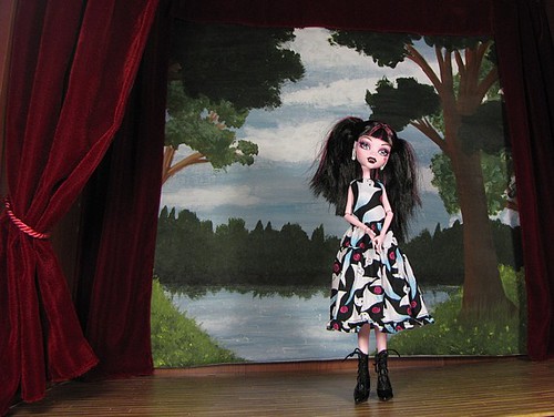
One school of thought wants to make the 1:6 set or diorama realistic down to the smallest details. I've seen people print and bind their own legible books for mini libraries, make their own quilts for mini beds and construct matching storage boxes for mini shelves. These are the people who have at least 4 different backgrounds, 1 for each season, to stick outside their set windows. These are the people whose 1:6 clocks most likely have movable hands to indicate passing time in successive scenes. They build stone walls out of individual Styrofoam bricks, which are then weathered with multiple coats of paint. These are the people who dislike Barbie stuff because it's slightly undersized for 1:6. These are the people who use multiple plastic cats, all painted the same, but in different positions, to stand in for a 1:6 pet in different positions. This school of thought has nothing but my admiration, but it is certainly not me.
My school of thought is defined by a suggestive aesthetic, more akin to that of sets for a play. Things don't have to look meticulously similar to reality; they just have to look close enough to suggest reality. Books are made out of small pieces of foamcore wrapped with paper. There may be one quilt that appears on all different beds and one storage unit that appears in different room sets. People who merely suggest reality probably ignore windows as excessively detailed. They don't care about the hours shown on 1:6 clocks. Their stone walls are made from printed cotton fabric stapled to foamcore. They don't weather anything. Barbie stuff is fine; even the pink can be acceptable. Plastic pets have only 1 position. My aesthetic is defined by ease of creation, parsimony and reuse.
1 Comment
For years, my ideal image of a photography backdrop (a small set, really, since it does involve more than just what’s behind the doll)was something that looked like a stage, with a stylized painted landscape hanging behind. For years I approximated that with printed cottons, especially the fluffy-white-clouds print. Last year, I finally decided to see if I could make a set-up anywhere near what was in my mind, and came up with this

It’s a good blend of realistic and complete fancy, I think. And it’s good enough for 75% of my photos taken inside (the others are on the same stage, just with something else thrown on as a background). I know there are people who would never tolerate taking so many pictures on the same background (they tend to have large supplies of scrapbook papers), and I know there are people who would never even tolerate the idea of taking doll pictures in anything but natural light. Neither of those ideas appeals to me. Do what suits you best, right?