The Girl, one of Daz’ iconic figures [and, in more recent versions, figure morphs], began life as a toon created by Kim Goossens. Daz or its predecessor Zygote acquired the figure and all rights to it, I guess. From then on, the Girl joined Victoria, Michael, and a small elite of characters that appear in [almost] every generation of figures that Daz puts out.
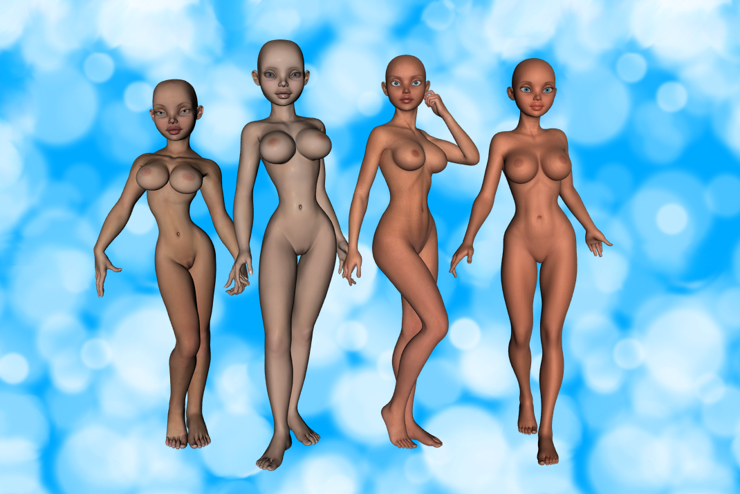
The Girl has four iterations so far. The first was as a standalone figure by Kim Goossens, a contemporary of Victoria 3. The second was a character morph of Victoria 4, called Girl 4. The Girl skipped the next generation of Daz figures, Genesis 1. However, Girl 6 showed up as a morph of Genesis 2 Female. Most recently, Girl 7 appeared as a character for Genesis 3 Female. I put them in a lineup below to compare and contrast.

To begin with the first Girl — Girl Classic, I suppose you could say — I instantly notice her distinctive toony style characterized by disproportionate largeness. The eye immediately goes to all her exceptionally large body parts: head, lips, shoulders, breasts, hands, and feet. As I stare at her large body parts, I can tell that Goossens lavished attention and detail on them [check out the graceful flexion in her hands!] while completely bypassing other areas. In fact, Girl Classic’s limbs and core seem like afterthoughts, added only to connect all the interesting parts together. Her neck, her arms, and her legs have massive, undifferentiated, columnar shapes that would go much more harmoniously with a larger, more muscular frame. With her square cranium, strong jaw, and broad shoulders, she looks really blocky. I like her eyes, nose, facial shape, collarbones, shoulders, and hands, but nothing below the armpits.
Girl 4, Daz’ first in-house stab at the iconic character, shows an attempt to retain her signature style, while reducing some of the distracting weirdness of Girl Classic’s proportions. Reduction of shoulder bulk and wider, rounder hips give her a more balanced, less top-heavy look. A longer torso and smaller hands and feet add to the sense that attention has been distributed more equally when the modelers were detailing parts of her body. At the same time, her limbs, which are even less detailed than those of Girl Classic, appear simply swollen, rather than stylized. A fair reproduction of Girl Classic’s features, Girl 4’s head and neck seem extra blocky when stuck on her inflated body. The poor figure just comes across as bloated.
Girl 6, implicitly addressing the aesthetic distractions of Girls Classic and 4, errs on the side of realism. Head, hands, and feet are still oversize, but the shoulders:bust:waist ratio is much closer to real life. Also, for the first time, Girl 6’s breasts look like part of her, as opposed to basketballs glued to her pectorals. Losing the inflamed bulk of previous generations, Girl 6 has more defined and refined anatomy. While the shift toward realism improves some aspects of Girl 6 — arguably, everything from the neck down :p — the facial features lack much of the Girl’s distinctive personality. For example, what the heck happened to her eyes? I love the Girl’s far-apart, dramatically tilted eyes with large, heavy top lids, but Girl 6 just has generic wide, cute eyes without any of that personality. The Girl has always been a character of exuberant abundance, even if awkwardly expressed, but Girl 6 lacks that sense of moreness. If she weren’t standing with other Girls to make the family resemblance apparent, she’d just be some generic sexy toony woman.
Girl 7, obviously created in response to the more lifelike blandness of Girl 6, shows Daz’ attempt to restore the Girl to her former glory with as few of her former problems as possible. More athletic, more sculpted, and more voluptuous than Girl 6, Girl 7 fuses elements of Girl Classic’s awkward physique [powerful shoulders, lissome legs, antigrav breasts] into a shape of coherent stylization. Furthermore, Girl 7’s head hearkens back to the exaggerated eyes and lips that give her so much of her singular character. At the same time, because Girl 7 follows Girl 6’s trend of a rounded, oval skull, instead of the earlier Girls’ blocky, square skulls, she forms more of a harmonious whole than Girls Classic and 4 ever did.
Can you tell which one I like best? 😀
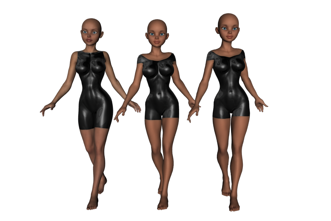
EDIT: Actually, my favorite combination is Girl 7 head + Girl 6 body. In the picture below, left to right, we see Girl 6 with default texture, Girl 7 with default texture, and G3F with Girl 7 default texture and head, but the Girl 6 body morph from Slosh’s G3F Genesis 2 Legacies: Classic. vyktohria’s Simply Latex shaders are attempting to preserve some modicum of modesty. All poses are from Sedor’s BWC Runway.
