Skip to content

Jareth has been updated.

Jareth has been updated. published on No Comments on Jareth has been updated.

Wow, when was the last time I posted a render?

One of the things that I really like about having digital likenesses of my characters is that I can change them over time. Applying different complexions and make-up involves simply loading up new textures, while experimenting with their shapes requires pushing morph sliders around. Therefore I can make drastic alterations to them without committing to anything permanent.


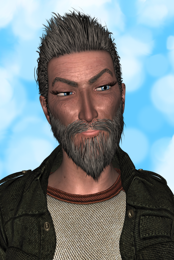
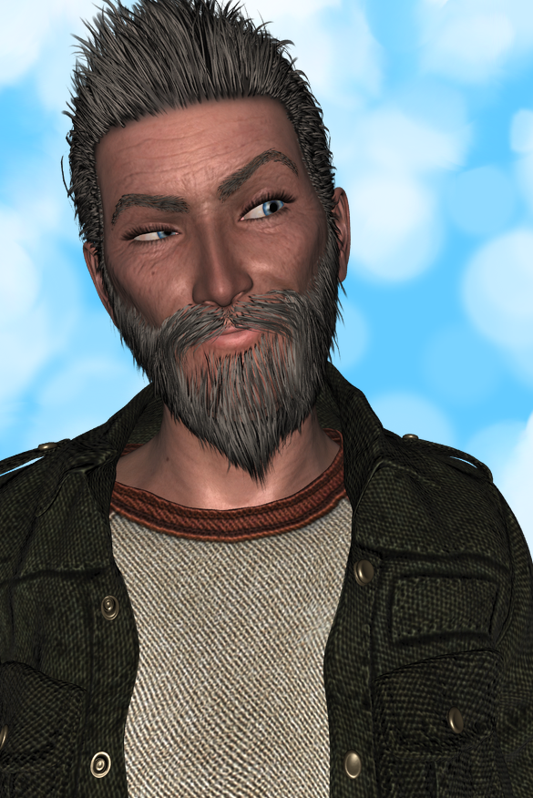
I changed my digital likeness of Jareth recently in a pretty significant way. He used to be stylized and cartoony, but I thought I’d see what he looked like in a more realistic representation. Instead of basing the digital version of him on the digital sculpt I made for my Jareth BJD, this likeness is based on my approximation of David Bowie from about 1975, with a lot of ageing, sagging morphs added, as well as some emaciation and curviness. Check him out.
 

morestylized
Here’s the more stylized likeness. See caption below for detailed credits; I don’t feel like retyping them. Note narrower face, sharper cheeks, longer and narrower nose, bigger eyes, higher arch to brows, etc.


uptosomething
Credits: Base figure is Genesis 2 Female. Lots of morphs are involved here, primarily my Red Planet Arachnid head morph, ported from Genesis with Dimension 3D’s GenX2 or whatever it’s called in this version. There is a small amount of my Jareth BJD head morph, which I made on the Michael 3 base with lots of help from Capsces’ Brom morphs. Hair, brows, beard, entire outfit, and texture [except for eyes, which are from RebelMommy and shellyw’s RMSD V4 MerchantBase] are all from Luthbel’s super-awesome character and outfit for G2M, Horror Survivors Marius. Pose from Sedor’s BWC Fashion Poses, tweaked by me. Custom expression is a blend of my infamous smirks [SmirkGleeful +SmirkDevious, I think]. Background from my Bokehground Expansion shaders.
I should probably clarify, for all zero of you that care about this sort of thing, that the “pretty significant” changes do not include his current complexion, hair, and clothes. I’m just talking about his level of realism in the digital realm. I have to admit, though, that I really like the effect of the texture, hair, and clothes, both when I imagine him and when I render him digitally, as they provide strong cues to the fact that he’s getting older. I’m a big fan of grey hair, crow’s feet, and laugh lines, otherwise known [to me, at least] as “smile brackets” or guillemets.

The second picture captures something essential about him, I think. You can see him thinking, laughing, observing, about to speak, which is apt, since he’s a quick-witted, smart-mouthed person. There’s a lot going on in his head, so even the fact that his hair is sticking up in a lively manner makes sense. At the same time, his constant activity doesn’t give him a sense of anxiety or self-importance. He obviously has a healthy sense of humor and a great sense of play — in fact, he probably sees a swing set just off screen that he wants to go play on. He would like to modify that statement that you have to grow old, but you don’t have to grow up. He says, “You have to grow old and even grow up, but you don’t have to grow out of learning and playing and taking joy in things.”

Leave a Reply

Your email address will not be published. Required fields are marked *

Primary Sidebar