First I hit the Burlington Farmer’s Market, where some artists had booths.
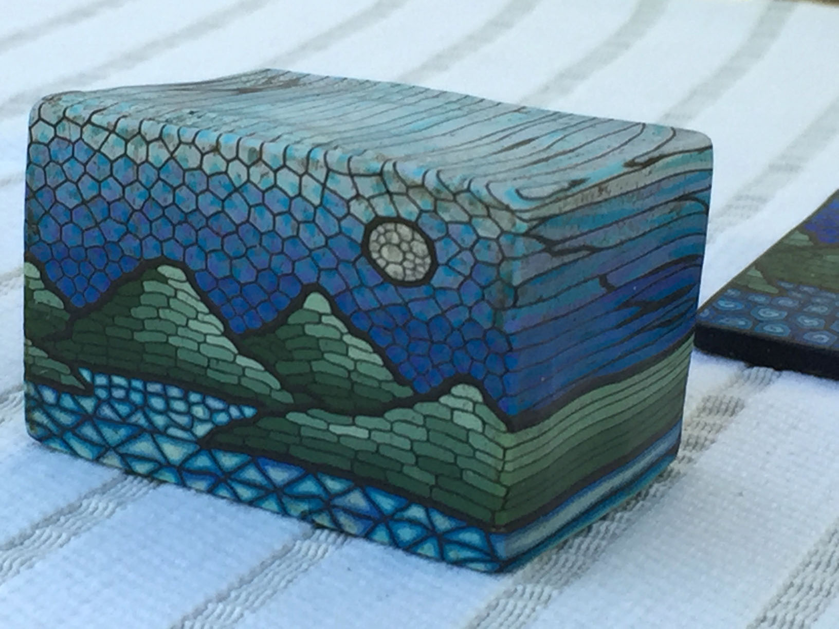
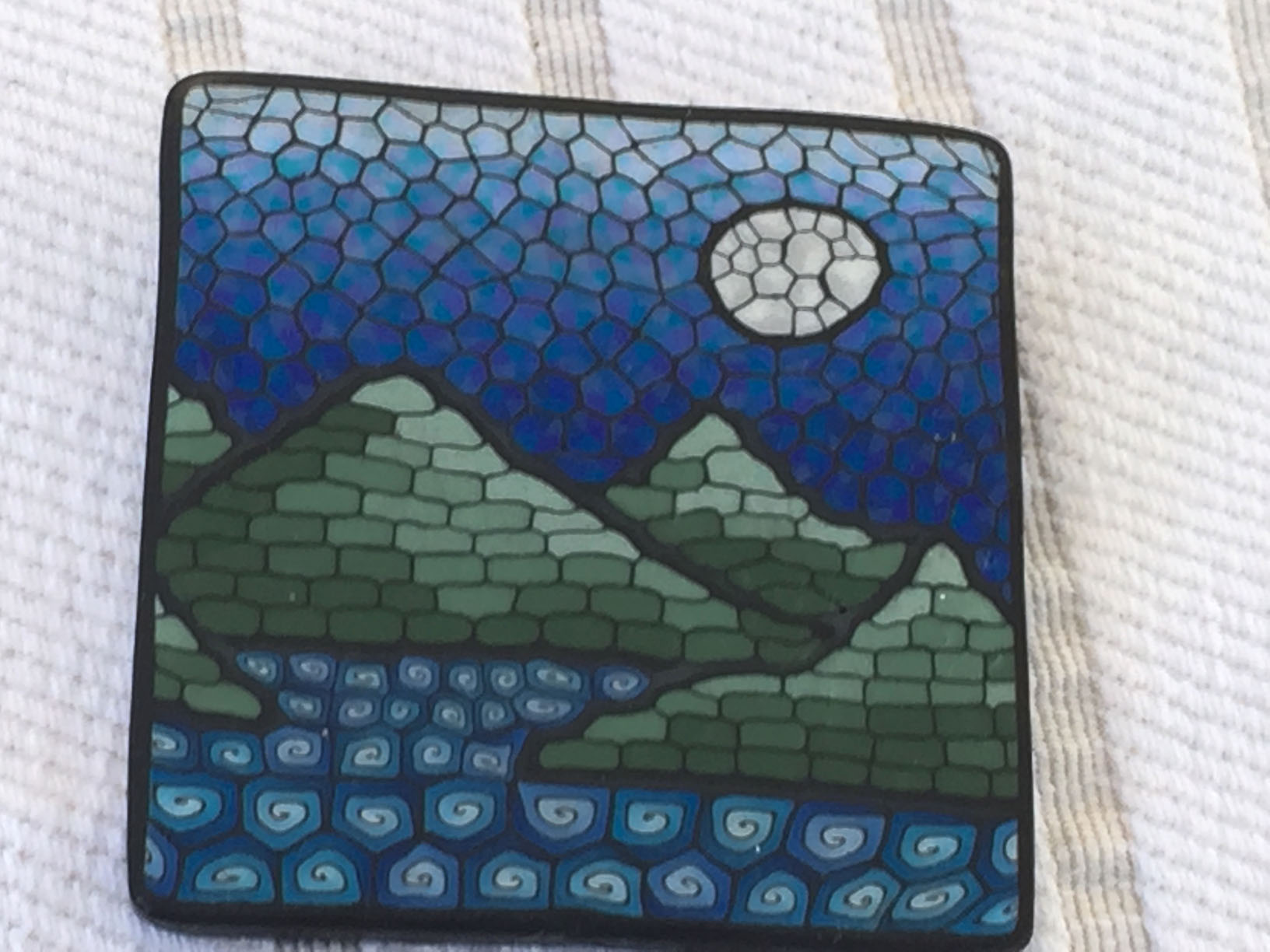
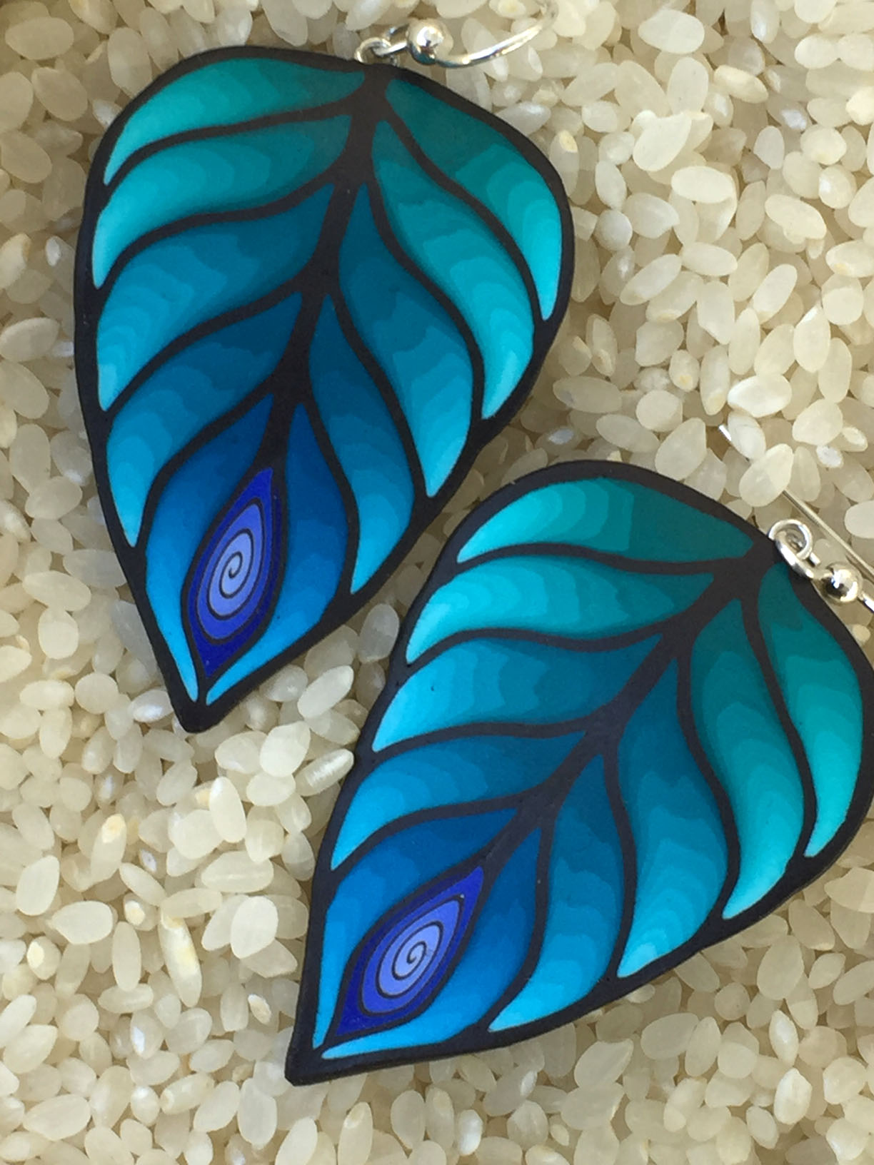
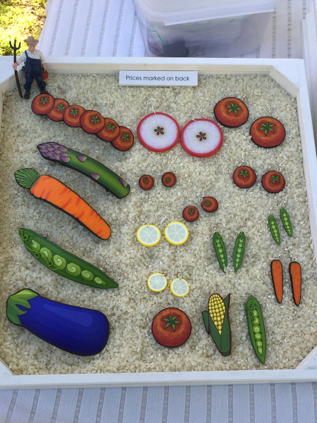
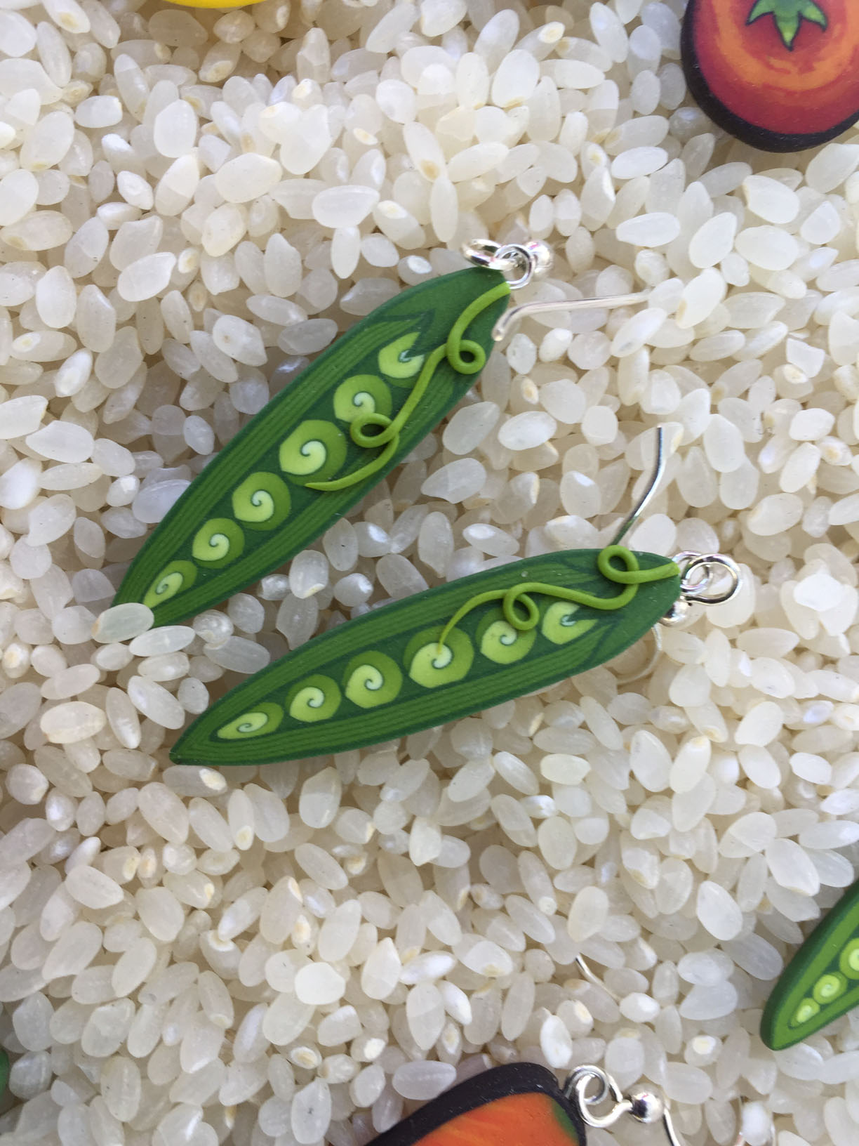
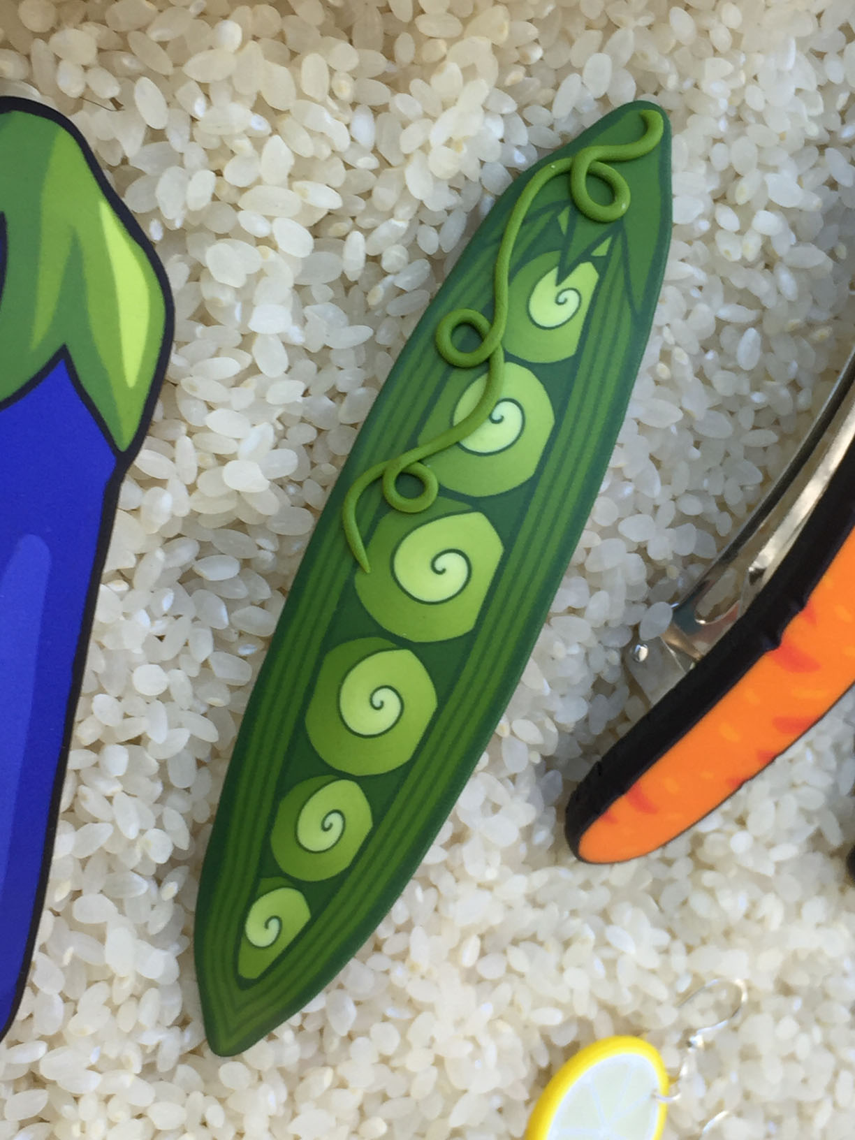
Marie Davis makes polymer clay jewelry with glowing, translucent colors.
She creates designs in loaves like this, created by layering stripes of clay, then slicing the loaf on the long end facing the camera to make various pieces. It’s a sophisticated form of caning.An example of a caned pin.
The playful swirly peapods were my favorite.
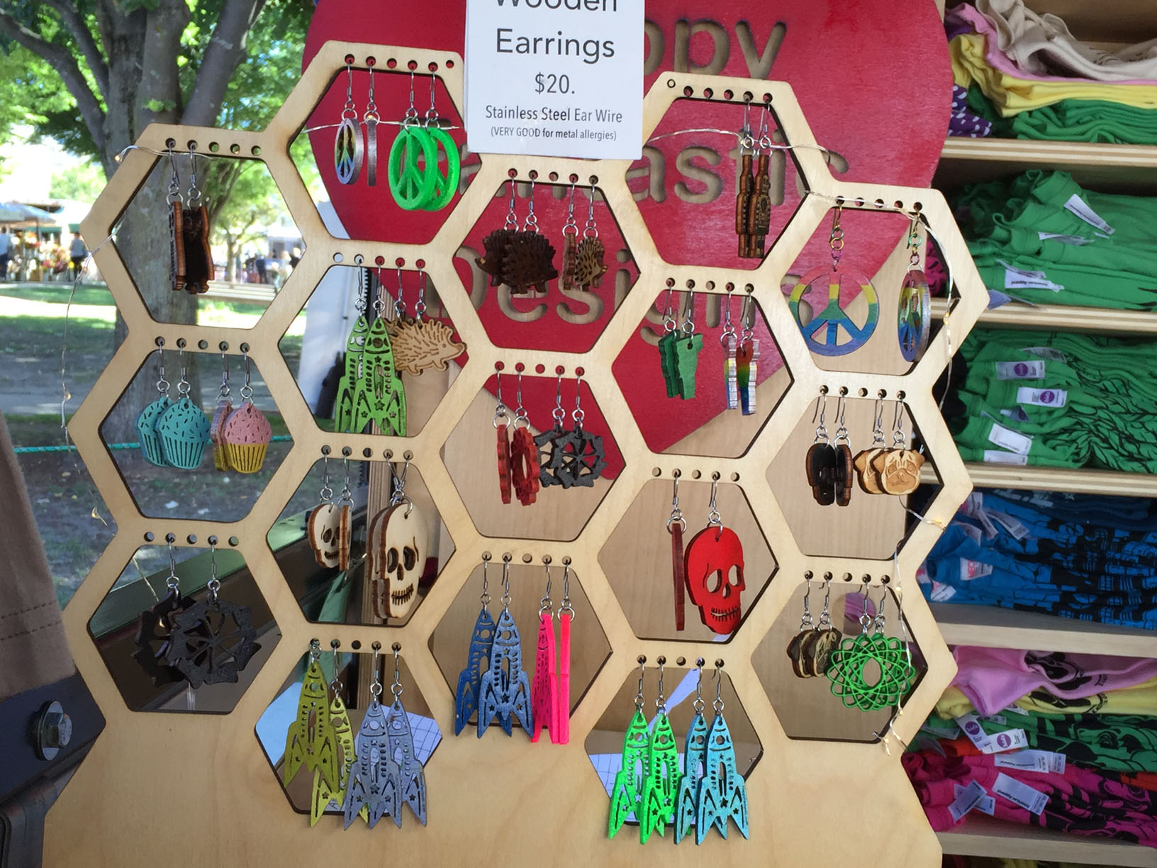
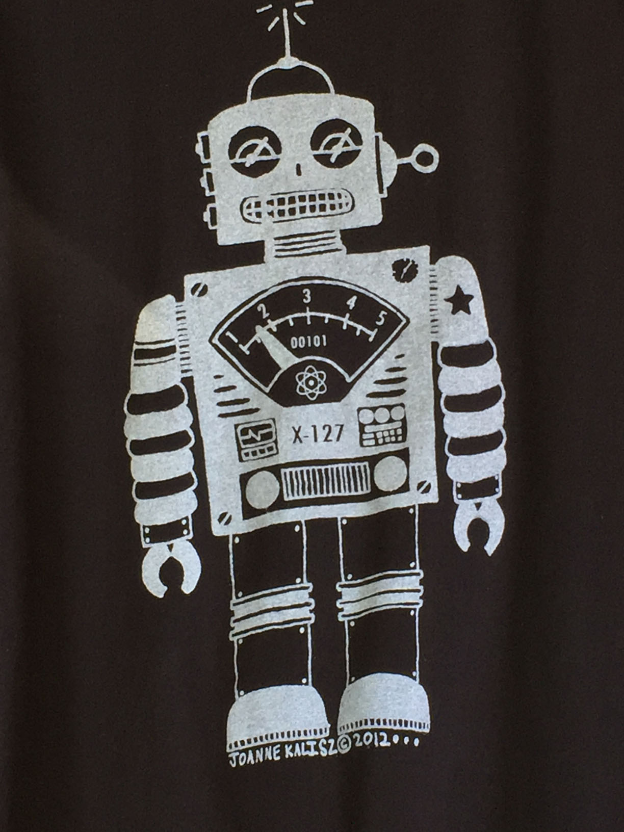
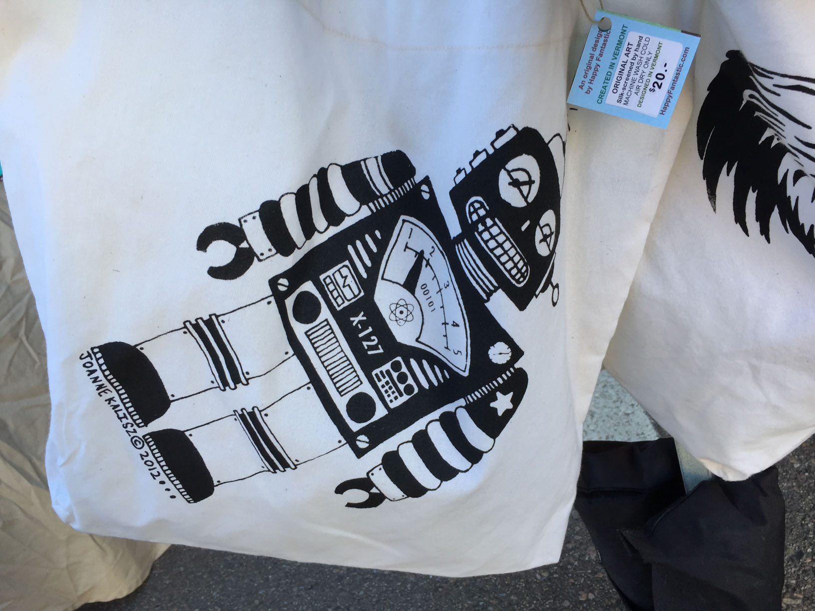
Joanna Kalisz does all the design creation, laser cutting, and screenprinting herself. She made the earring rack too.I love this design, which captures the quintessence of Atomic Age tinplate robot toys. I now have this T-shirt.
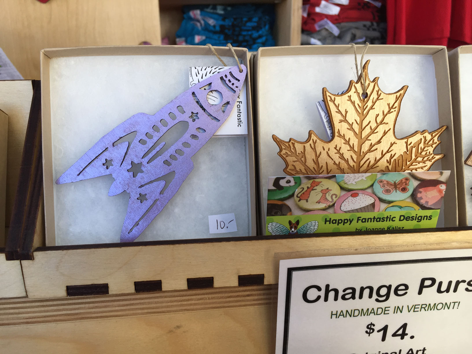
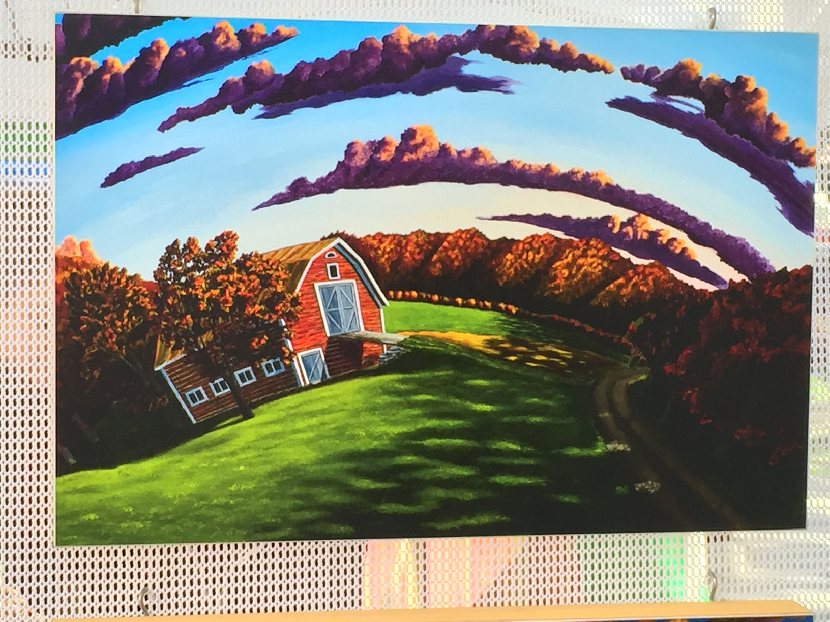
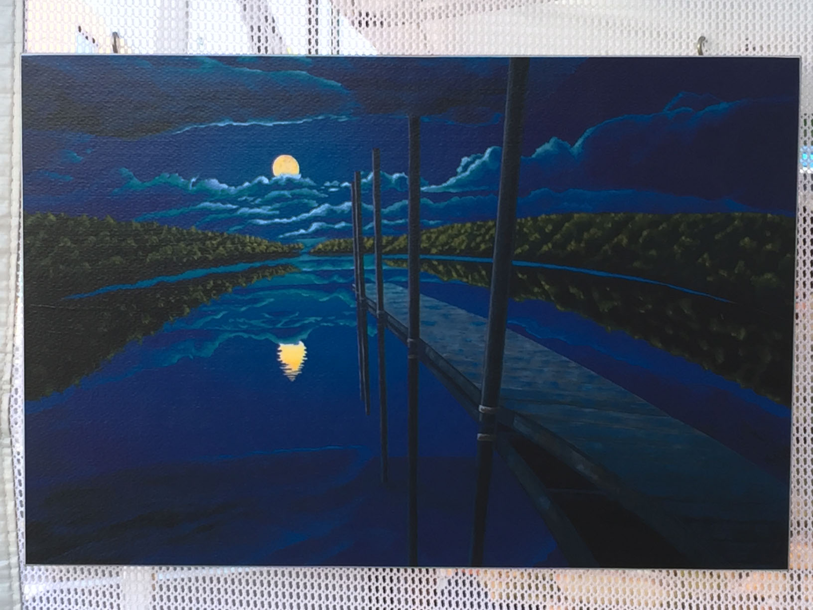
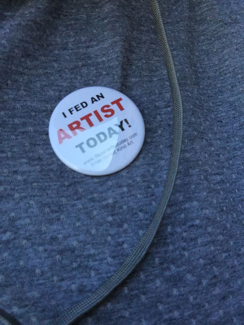
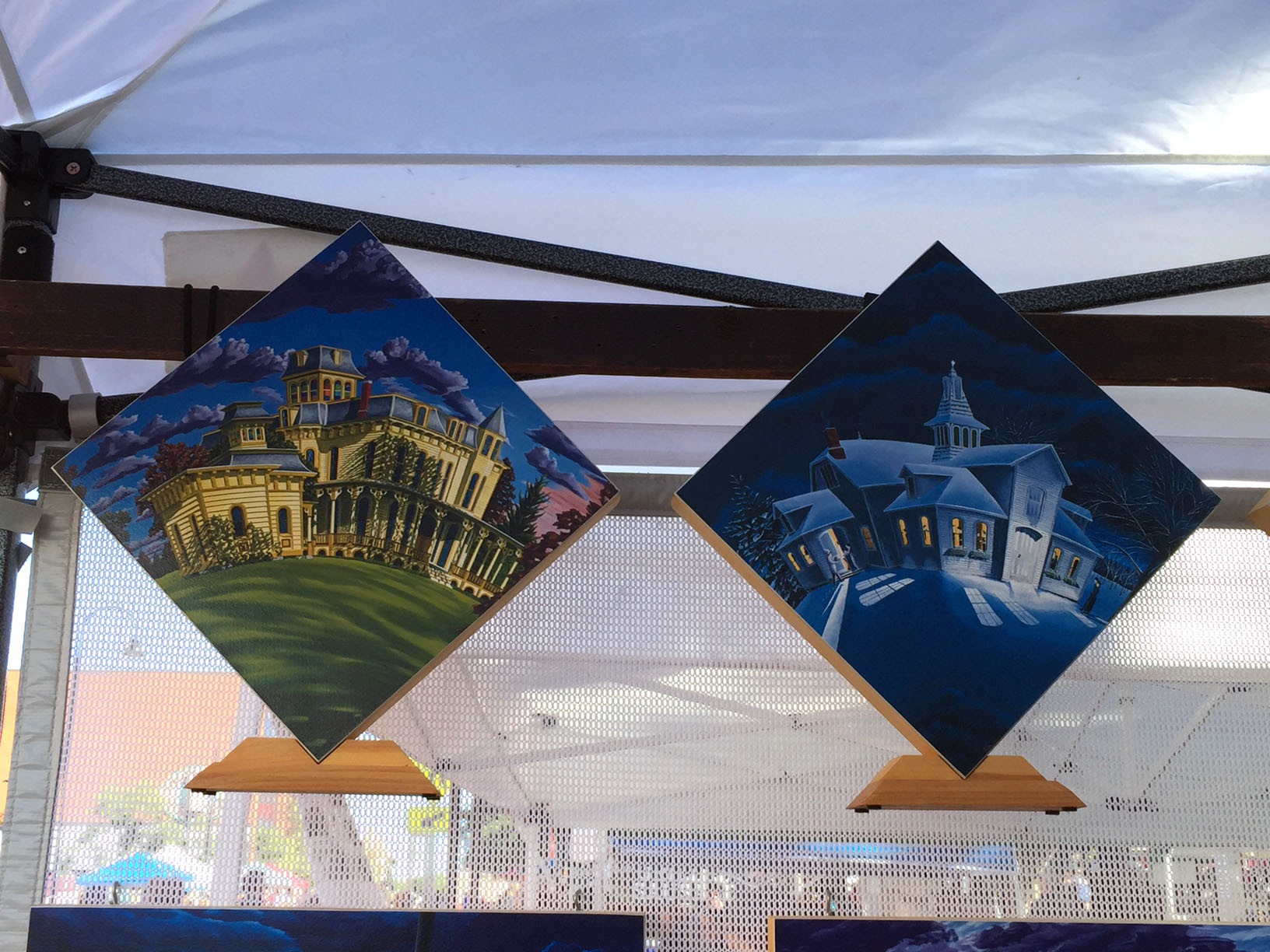
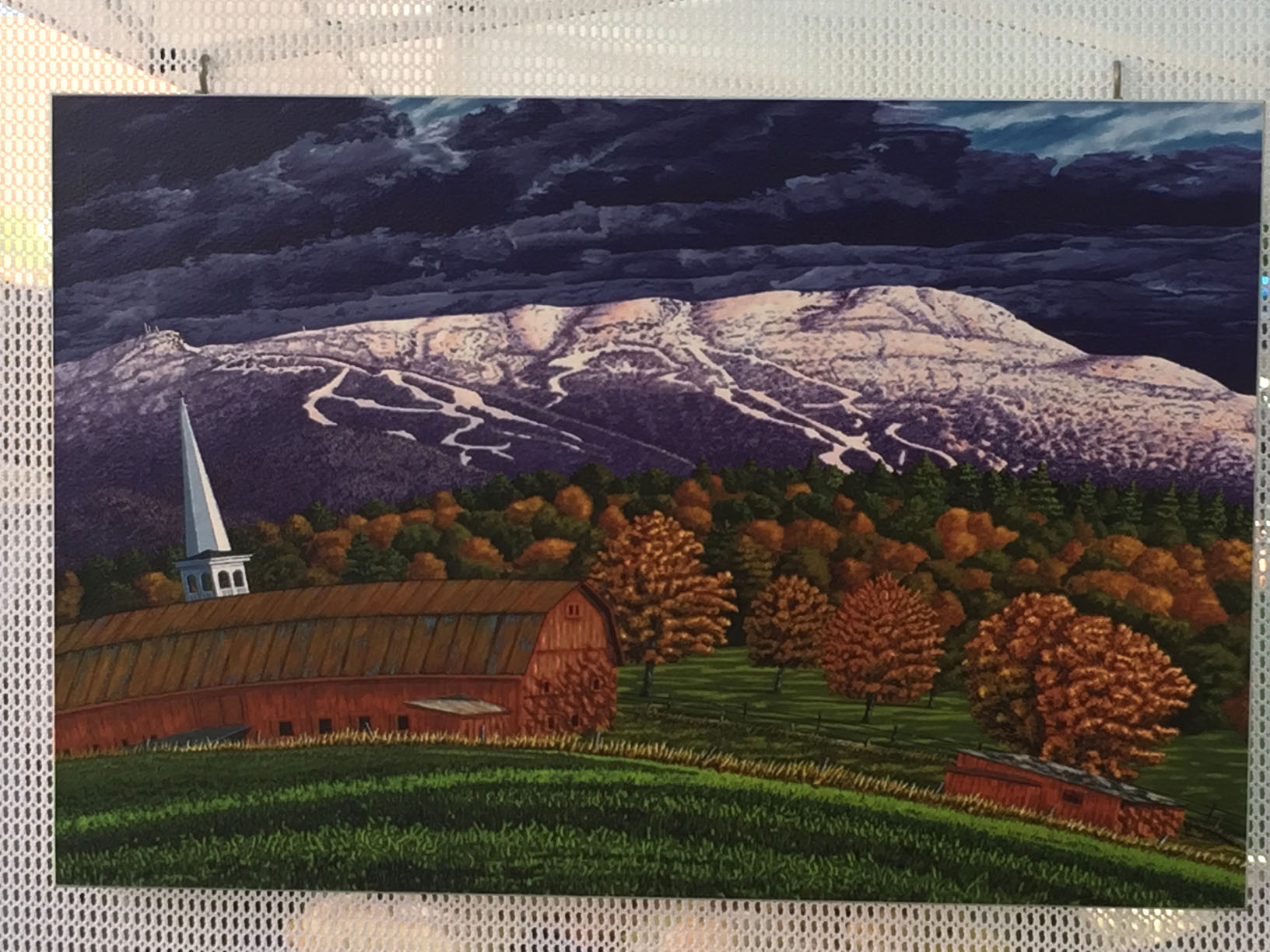
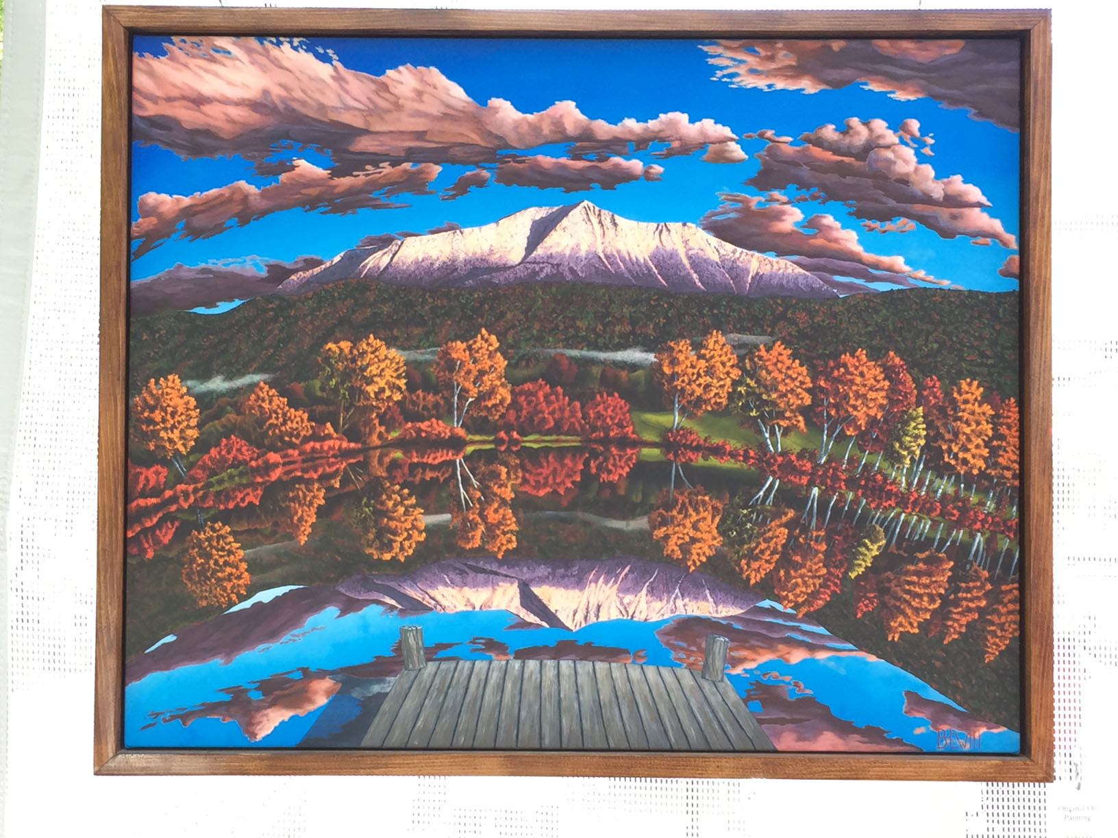
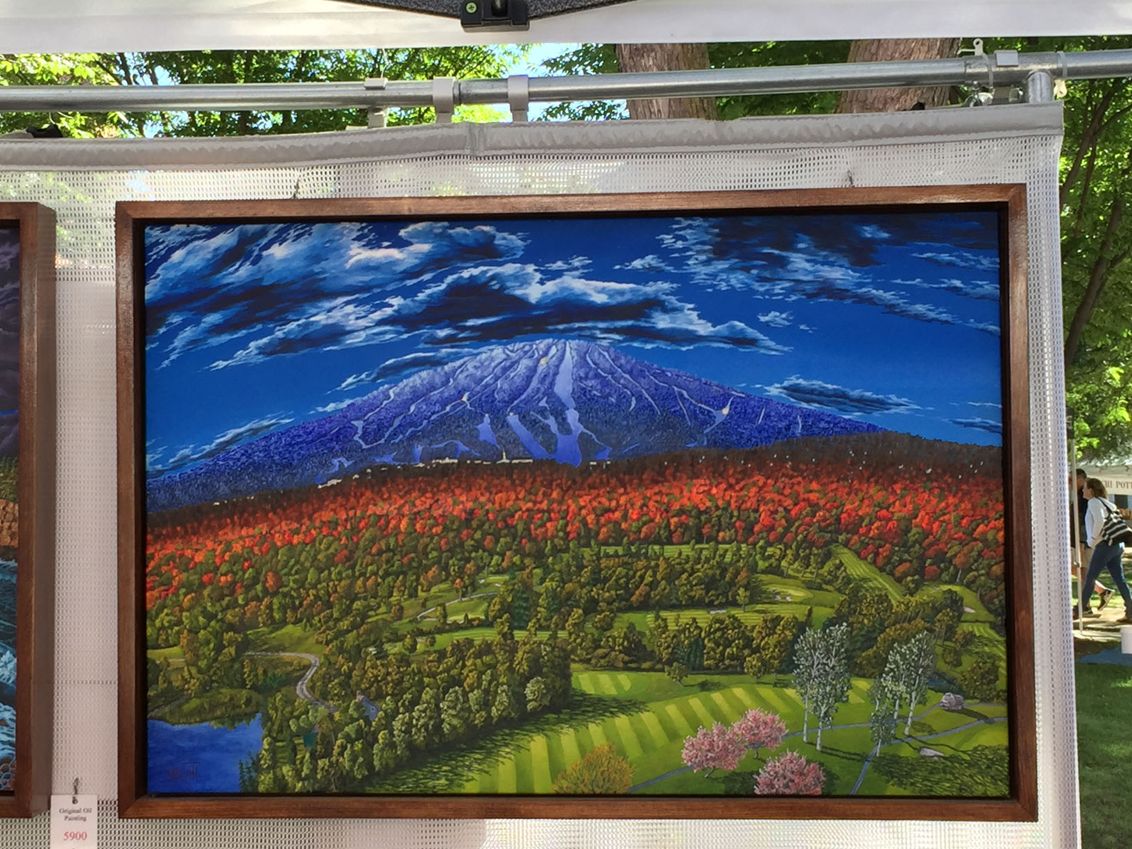
Quintessential Atomic Age rocket ships! So cool!The curved horizons on these pieces give them a fanciful, phantasmagorical air. The detail with which clouds and foliage are rendered makes everything seem like it’s in equal focus, giving it all the super clarity of a dream. These subtle distortions bring a playful and unusual energy to the standard Vermont landscape pictures.The old “dock leading out into still waters” subject gets dramatic treatment with an off-center framing and the trippy effect of the dock posts mirroring in the still water. I got a copy of this.Badge of honor from Brian Hewitt. 😀
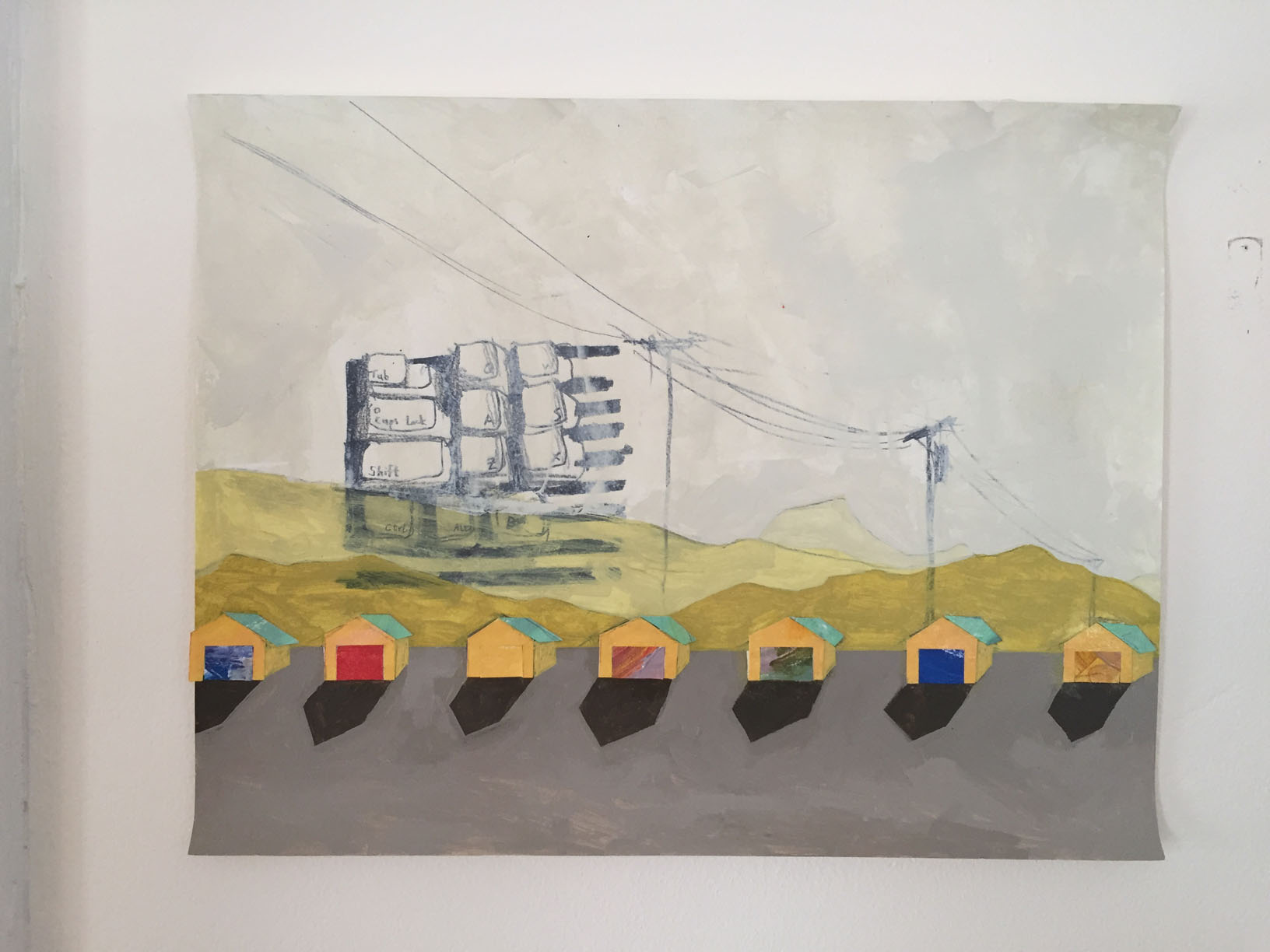
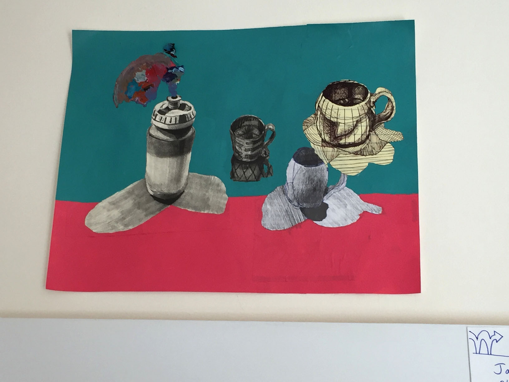
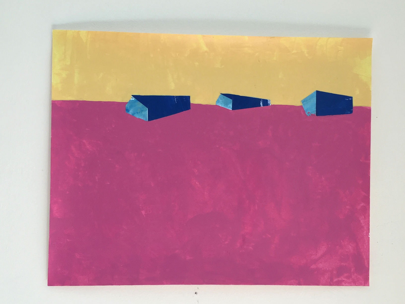
After enjoying the Farmer’s Market, I progressed down Pine Street to some artist studios. First started at James Secor’s As Not Seen series. Labels of each piece are in separate photos below the photos of the pictures.
This, my favorite of the pieces, made sense only in context with the others. I love how the use of color has been reduced to just four shades and the storage sheds are losing their form, swallowed up by the pink ground.
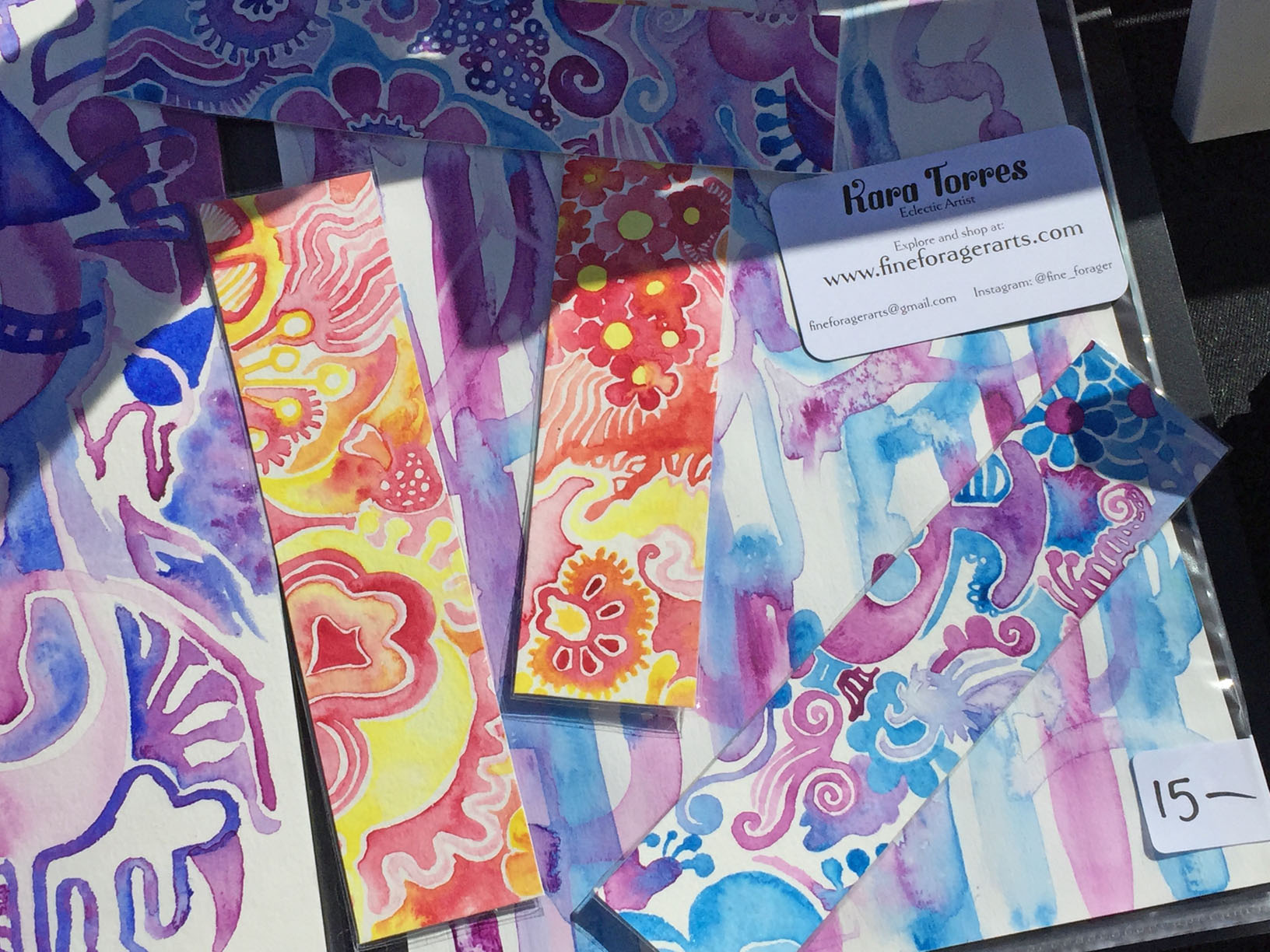
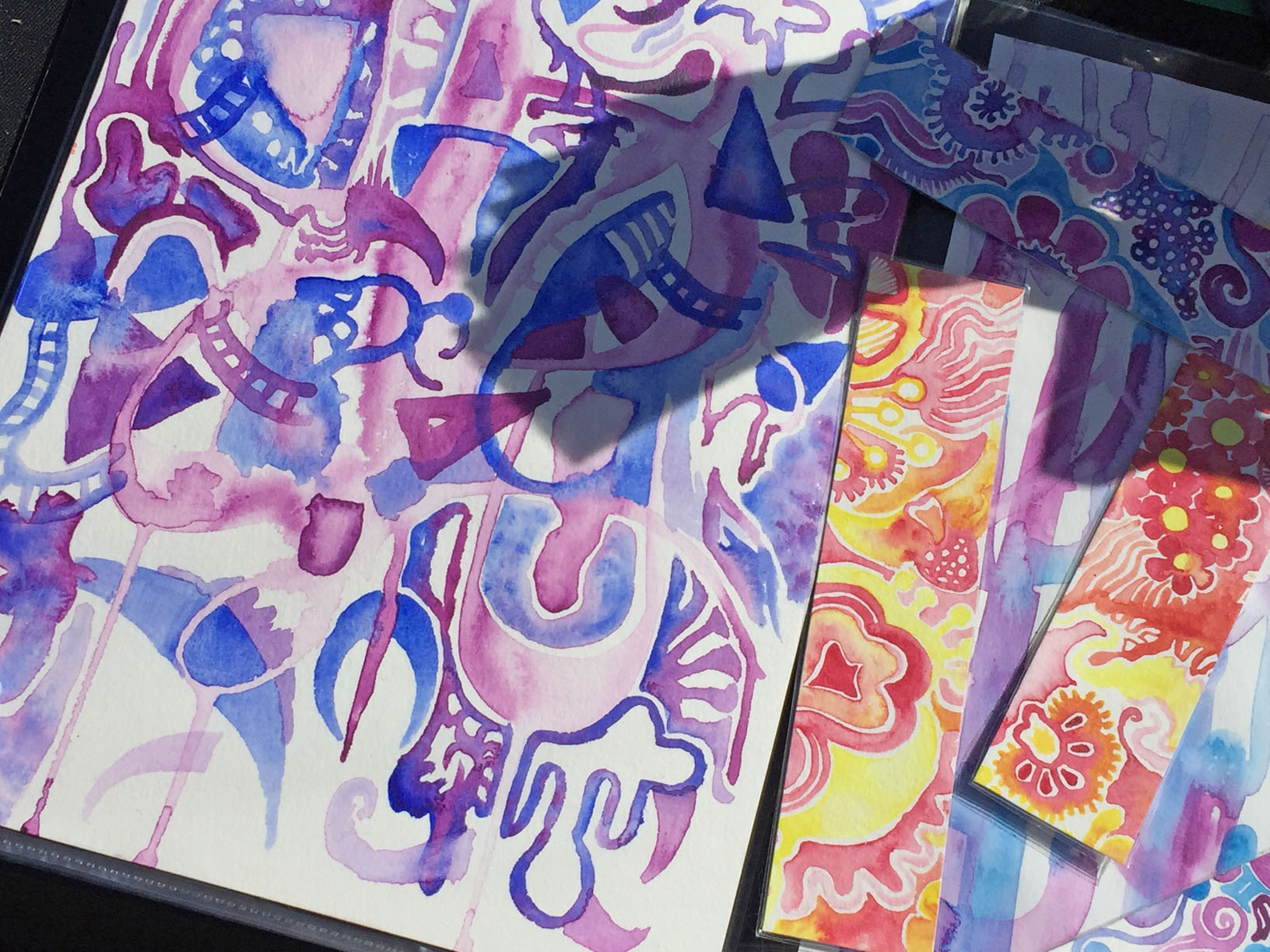
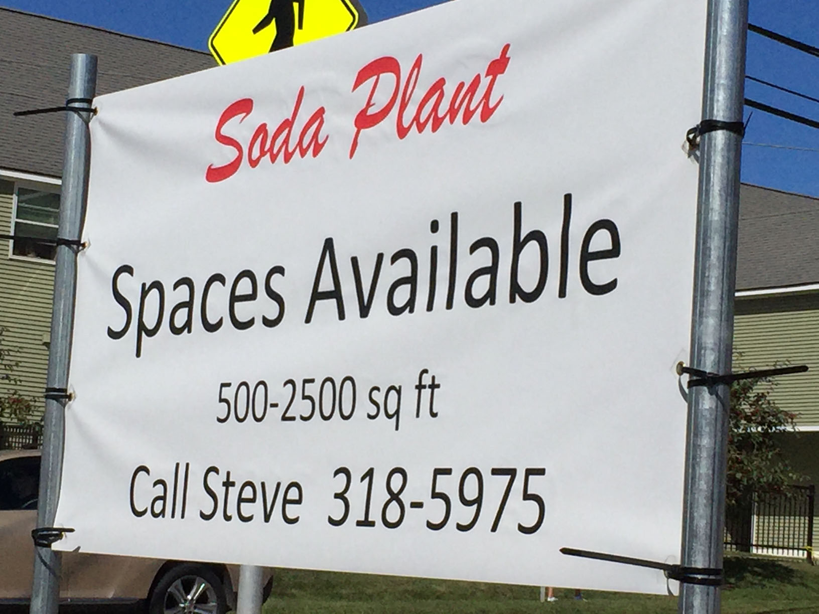
Kara Torres had a small table out in front of the Soda Plant on Pine Street. She painted cartoony characters, not shown, as well as swirly, semi-floral watercolors, many of which she cut into bookmarks. I took pictures of my favorites and also bought two.
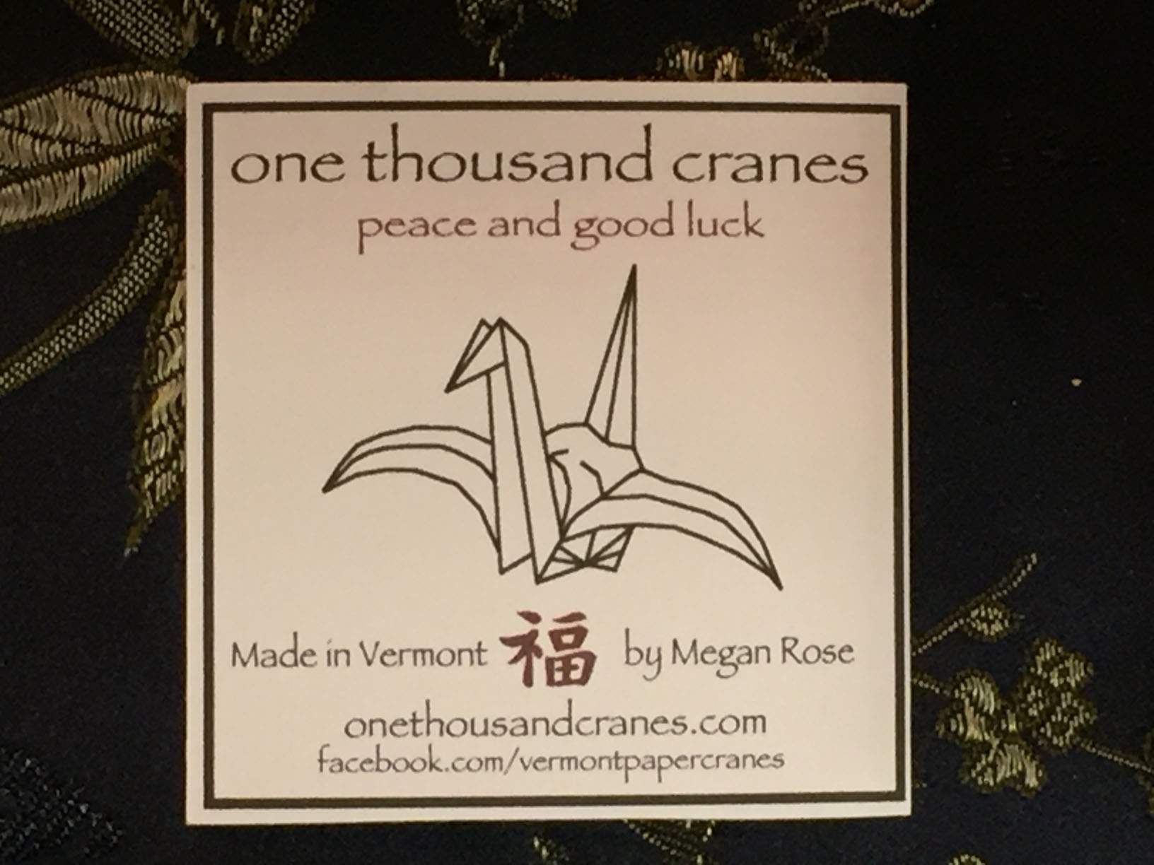
Megan Rose displayed earrings, pendants, and other decorations incorporating origami cranes. I was much more interested in her wire bonsai trees.
This tree is made out of wire that rusts over time, giving it a bicolor color more reminiscent of bark. I like the archetypical Creepy Tree shape, and the construction of sharp dangerous wire adds to its uncanniness.
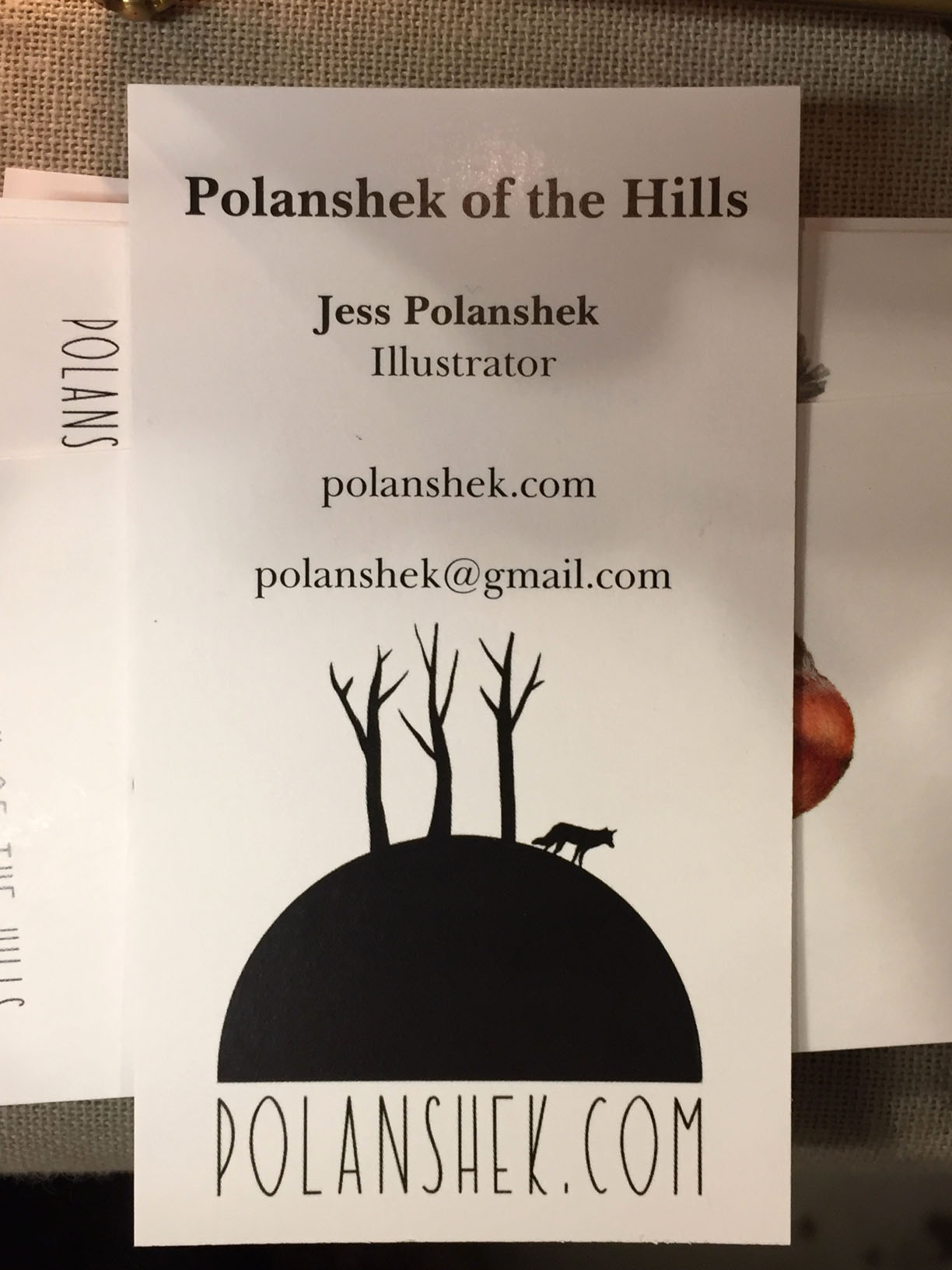
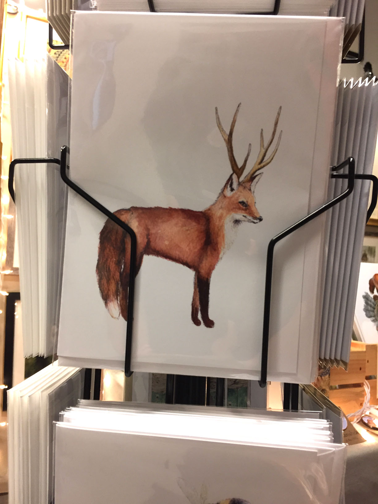
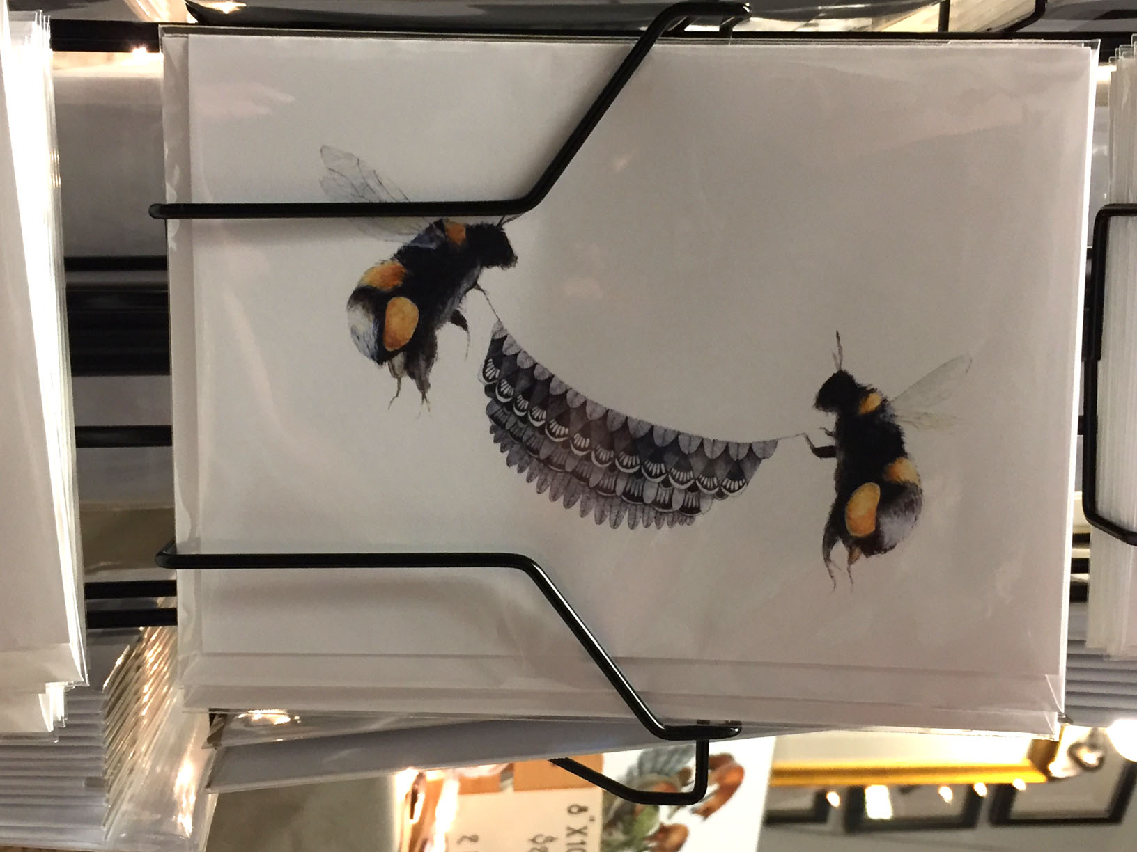
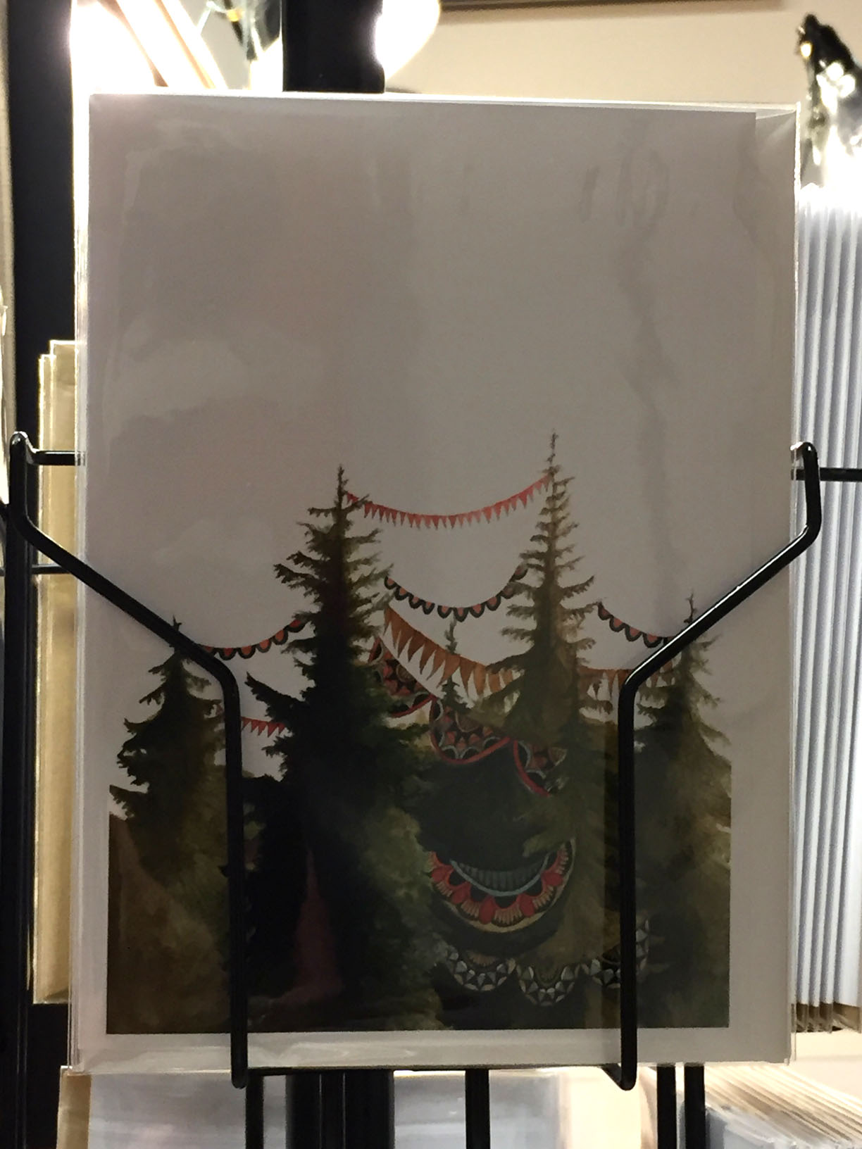
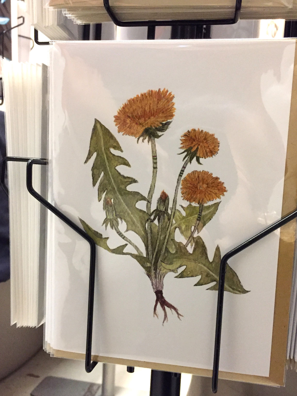
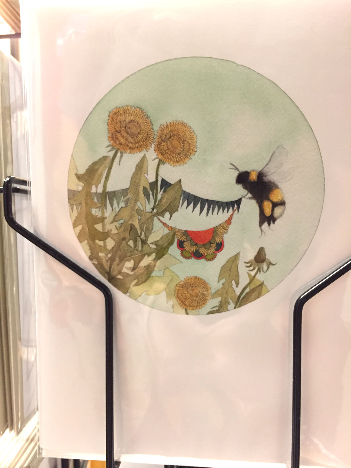
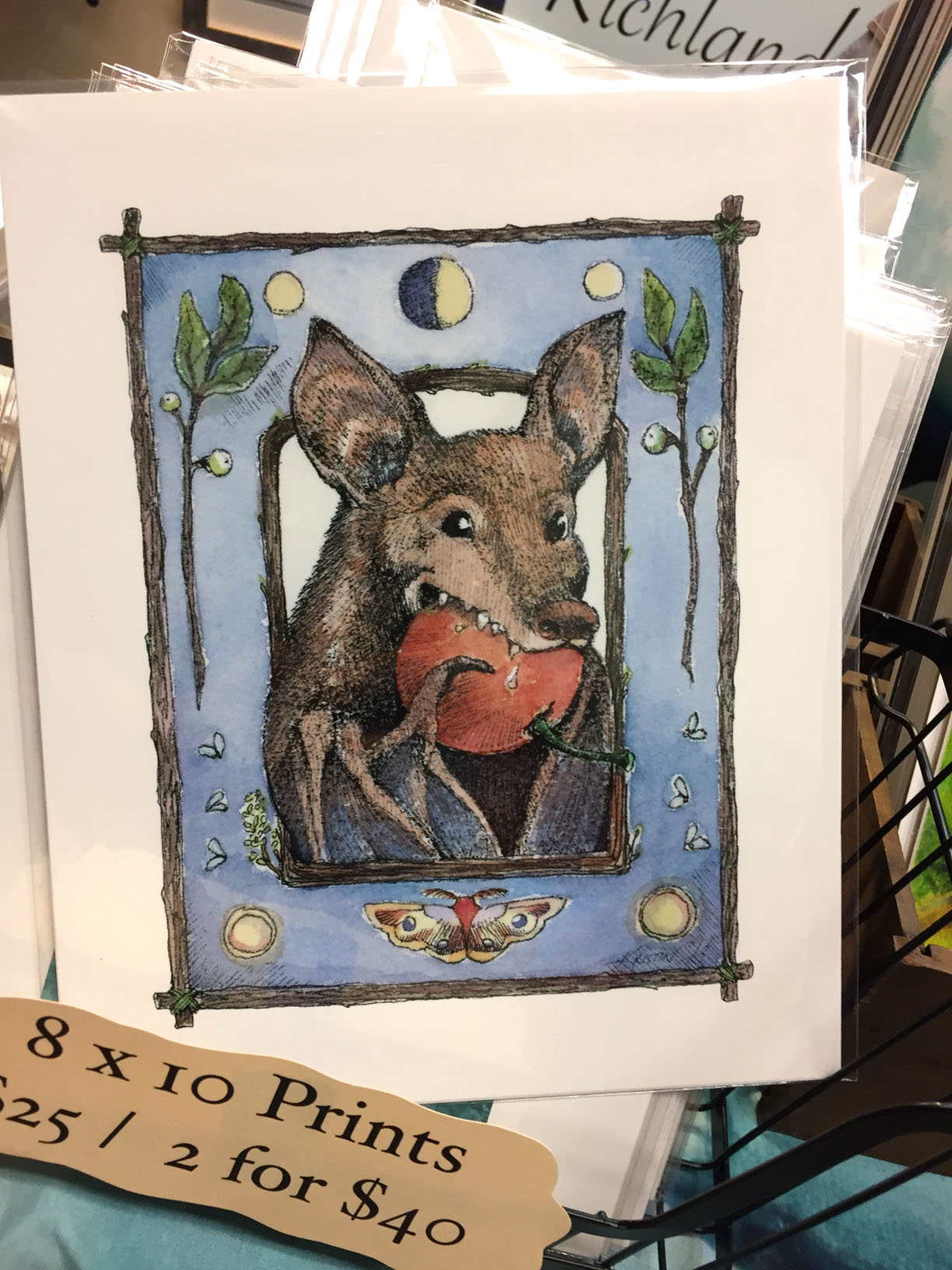
Jess Polanshek’s illustrations, full of floral details and mammals with expressive faces, have captured my interest for years. I purchased a large print of the jumping foxes for @supergranularqueer. 😀
Her textural line evokes perfectly the fluffy petals and the sharp leaves of the dandelion.
Purchased in notecard form for @natalunasans, who looks like this before [sometimes after as well] coffee.
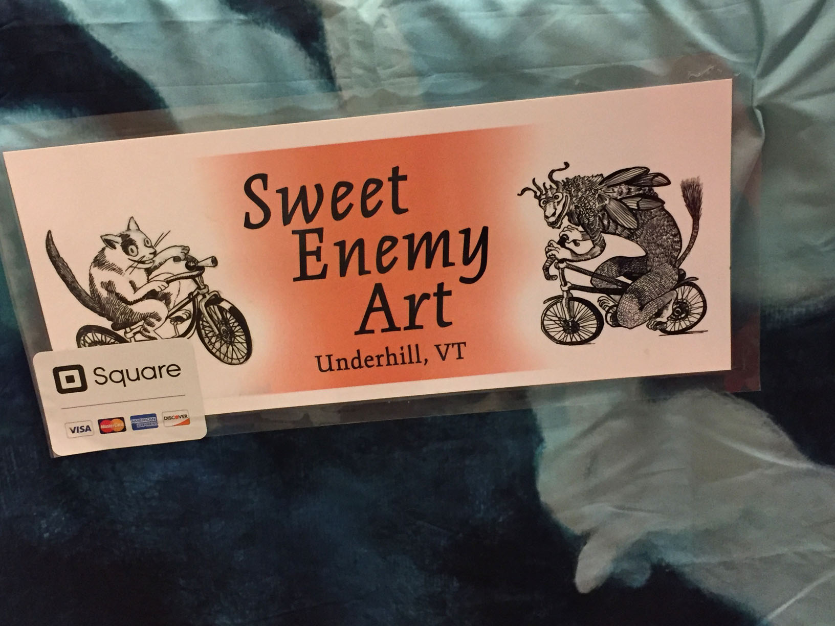
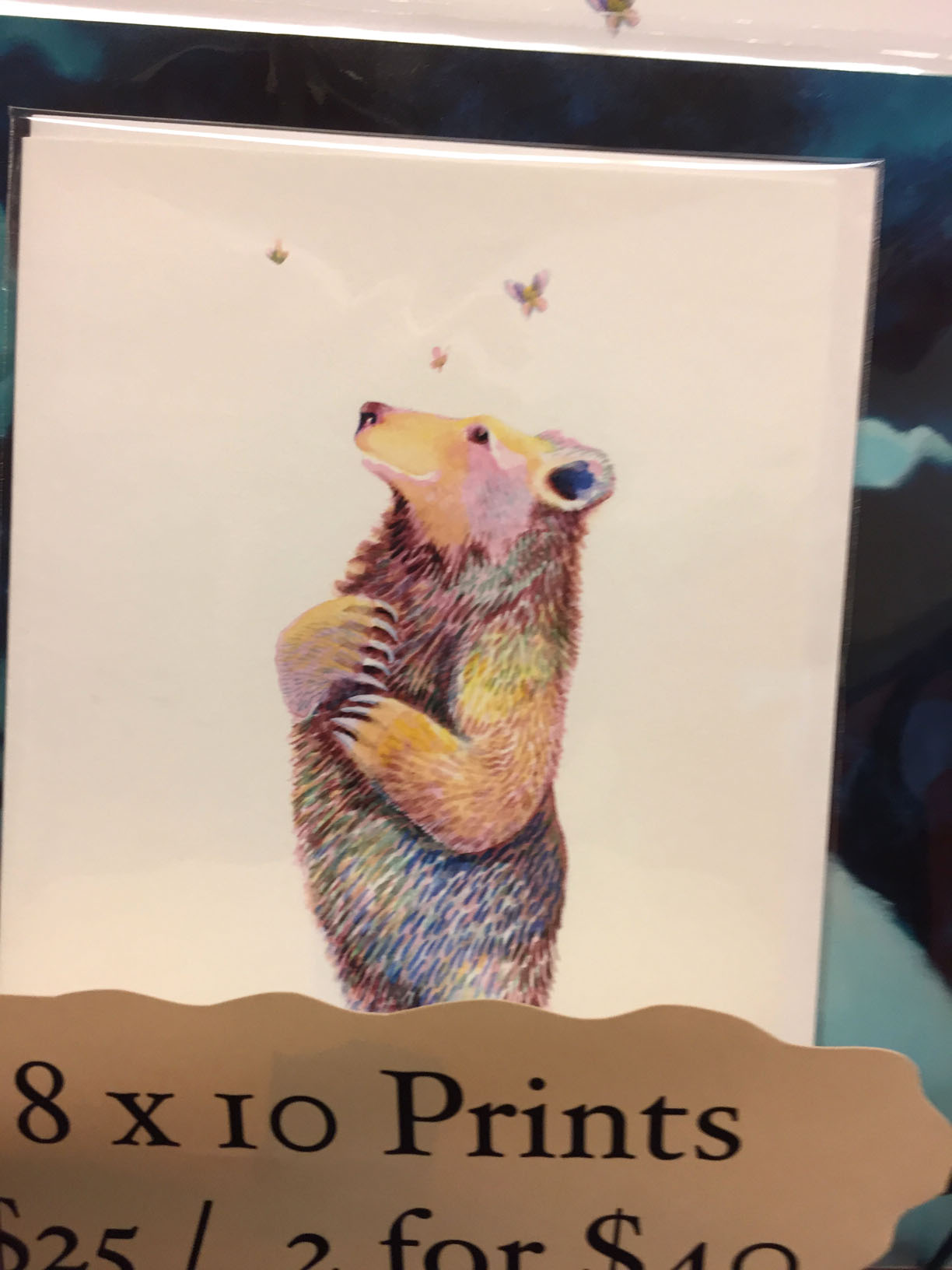
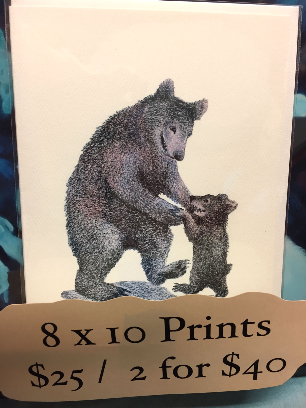
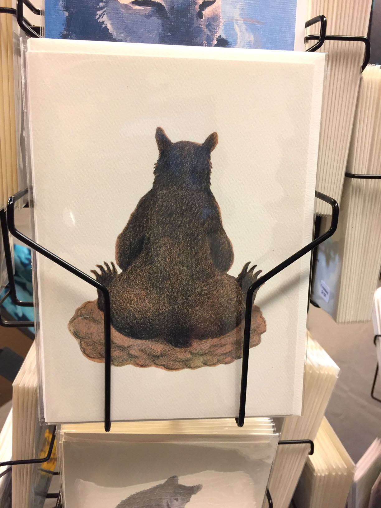
Sweet Enemy Art had quite a few bears on display, of which this was my favorite. In a balance of her humorous, realistic style, this is a naturalistically shaped bear, but with the posture of a human. Also showing the individual toes is really cute. Her pictures have a Maurice Sendak feel to them.
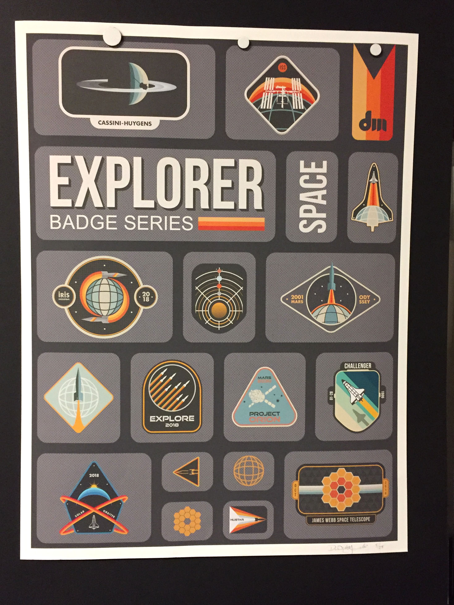
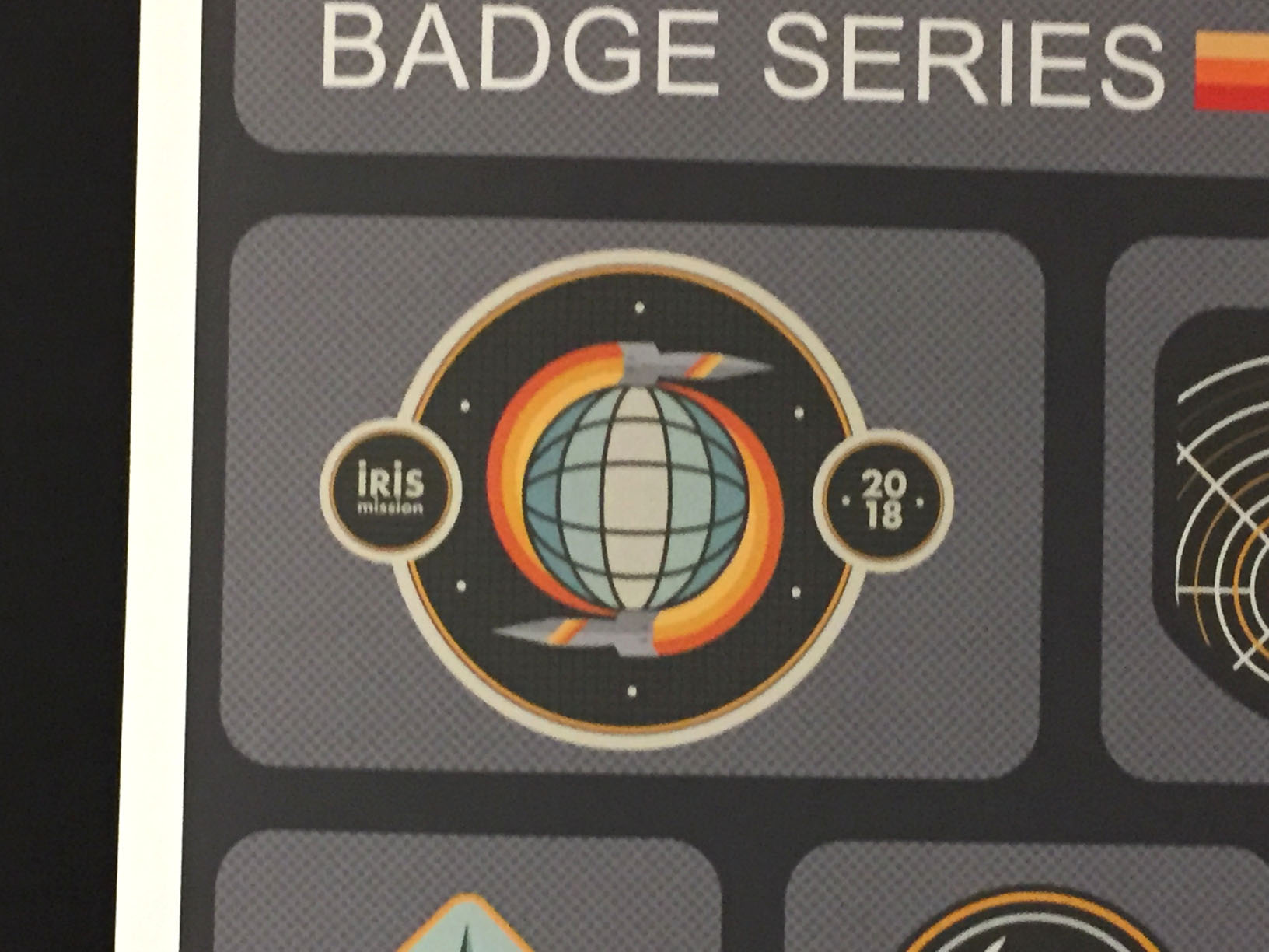
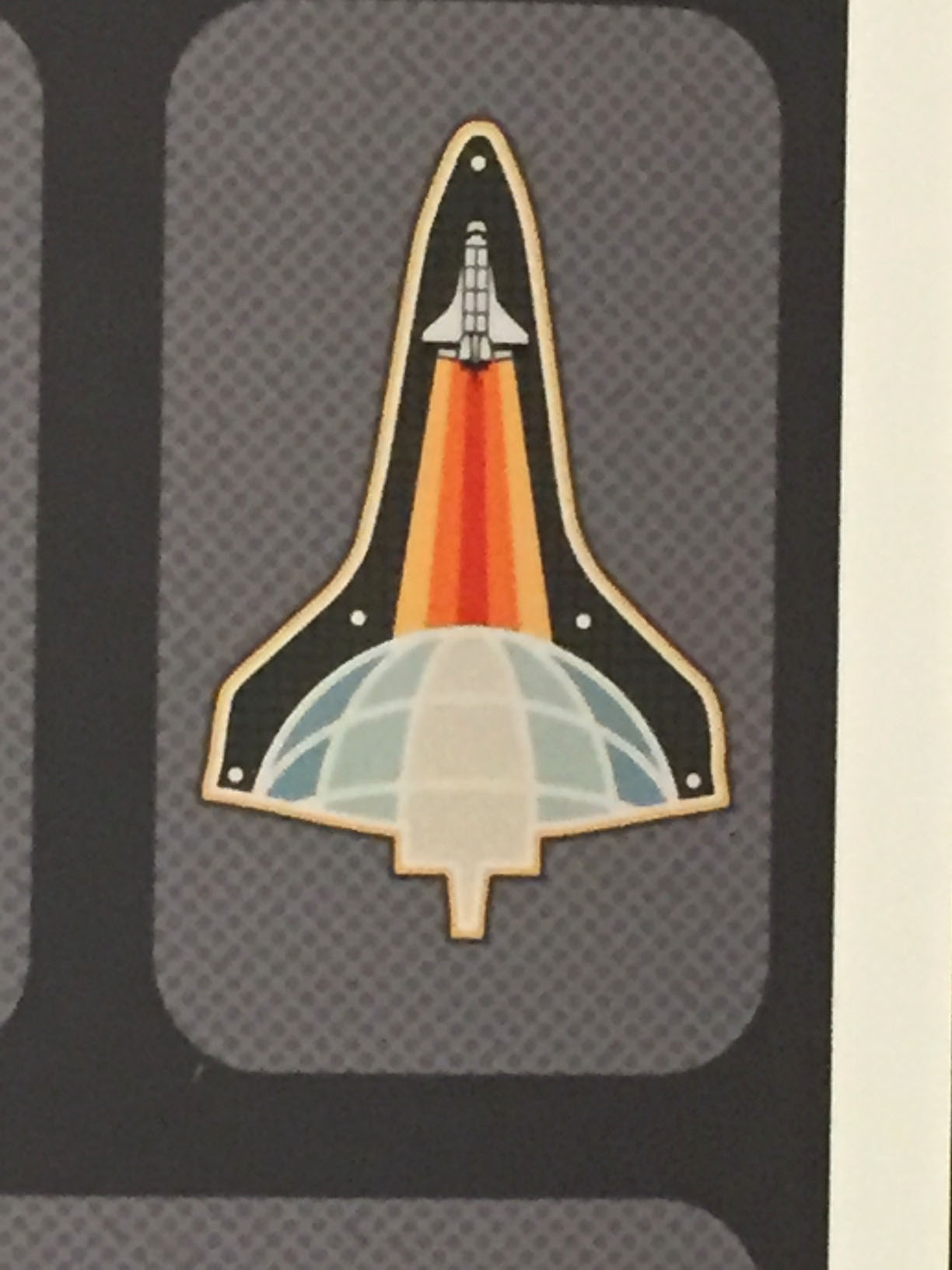
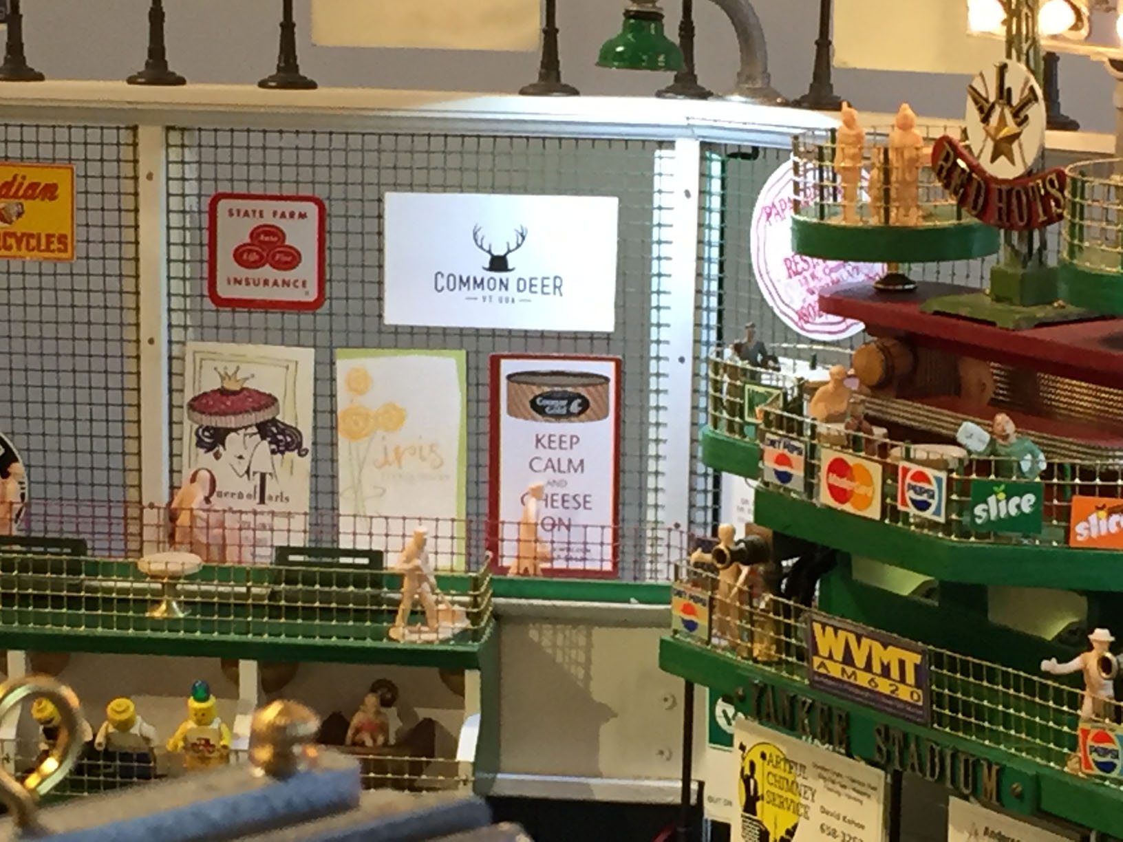
The use of limited palettes and badge shapes that follow subject matter really blast this series off into the outer space of niftiness. The IRIS badge, in particular, with its orbiting spaceships suggesting a swirl and the gridded circle resembling …well…an iris, strikes my eye. I thought that the artist had these designs for sale as badges, but, sadly, they were concept sketches, unavailable in more portable format. I encouraged him to put some of the designs on stickers, notebooks, T-shirts, patches, etc.
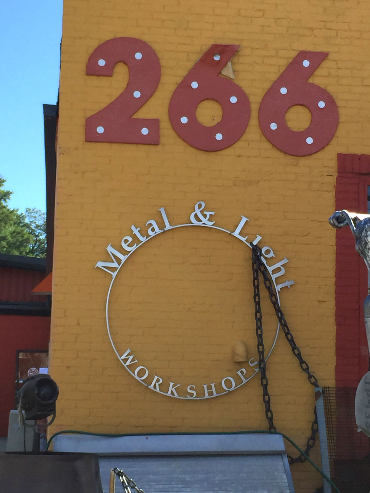
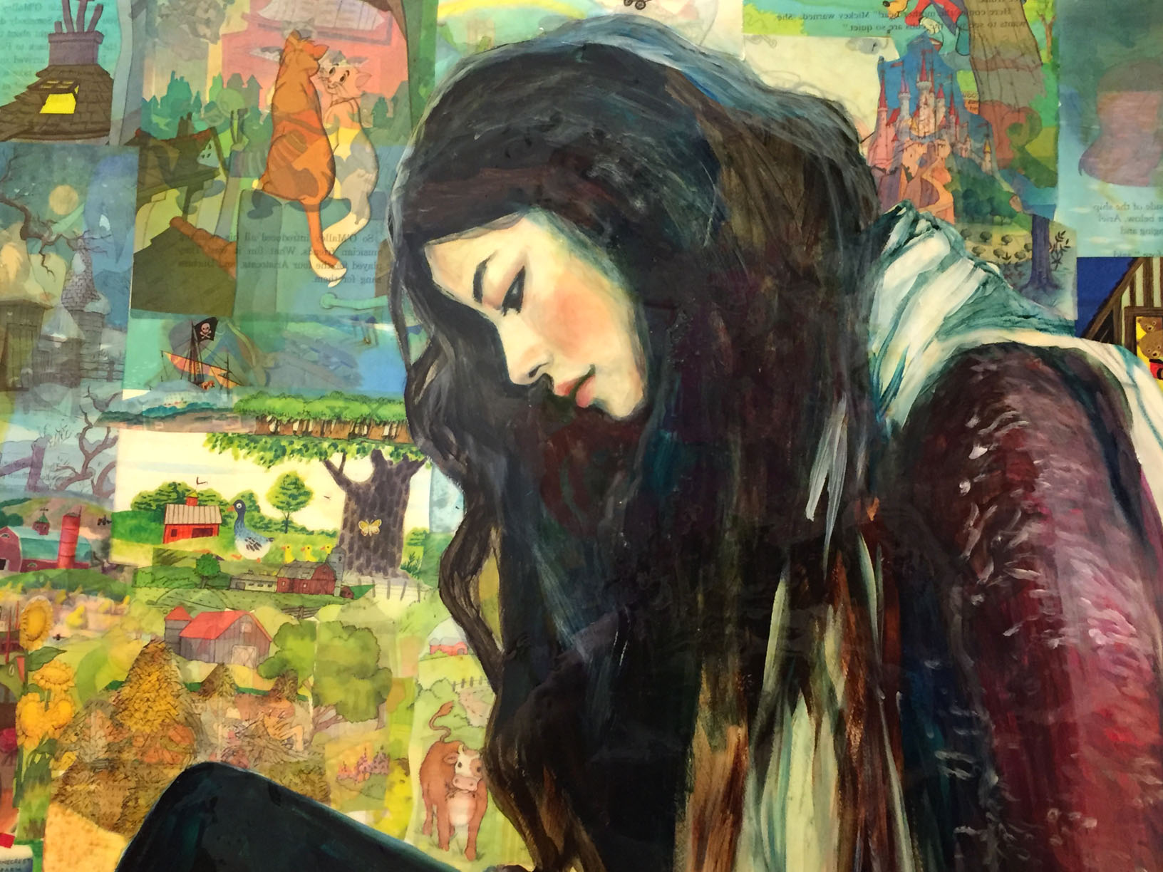
This was in the hallway between the Soda Plant and Conant Metal & Light…just a lovely portrait of a contemplative mood, along with a playful collage in effective gradations of color.
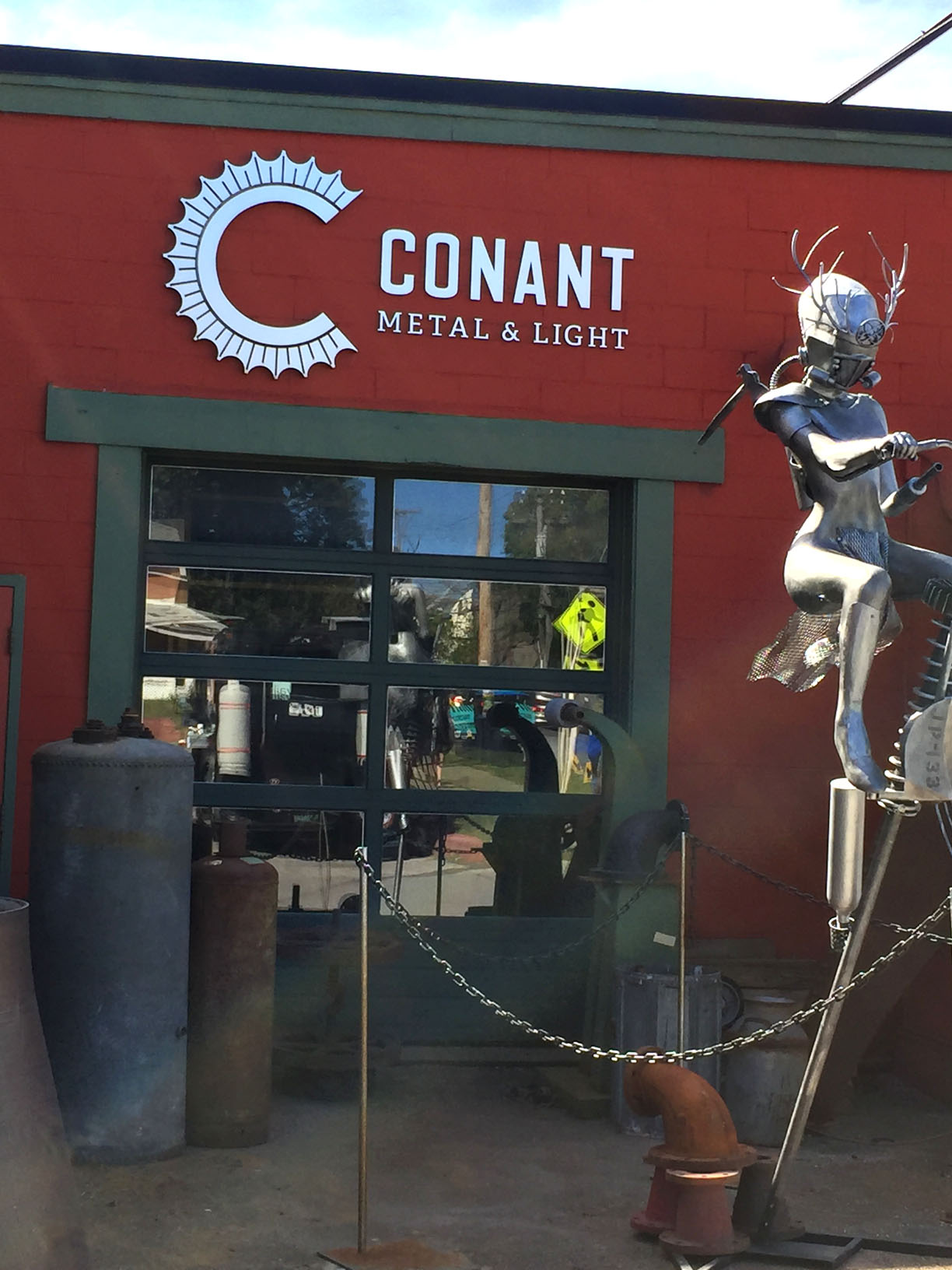
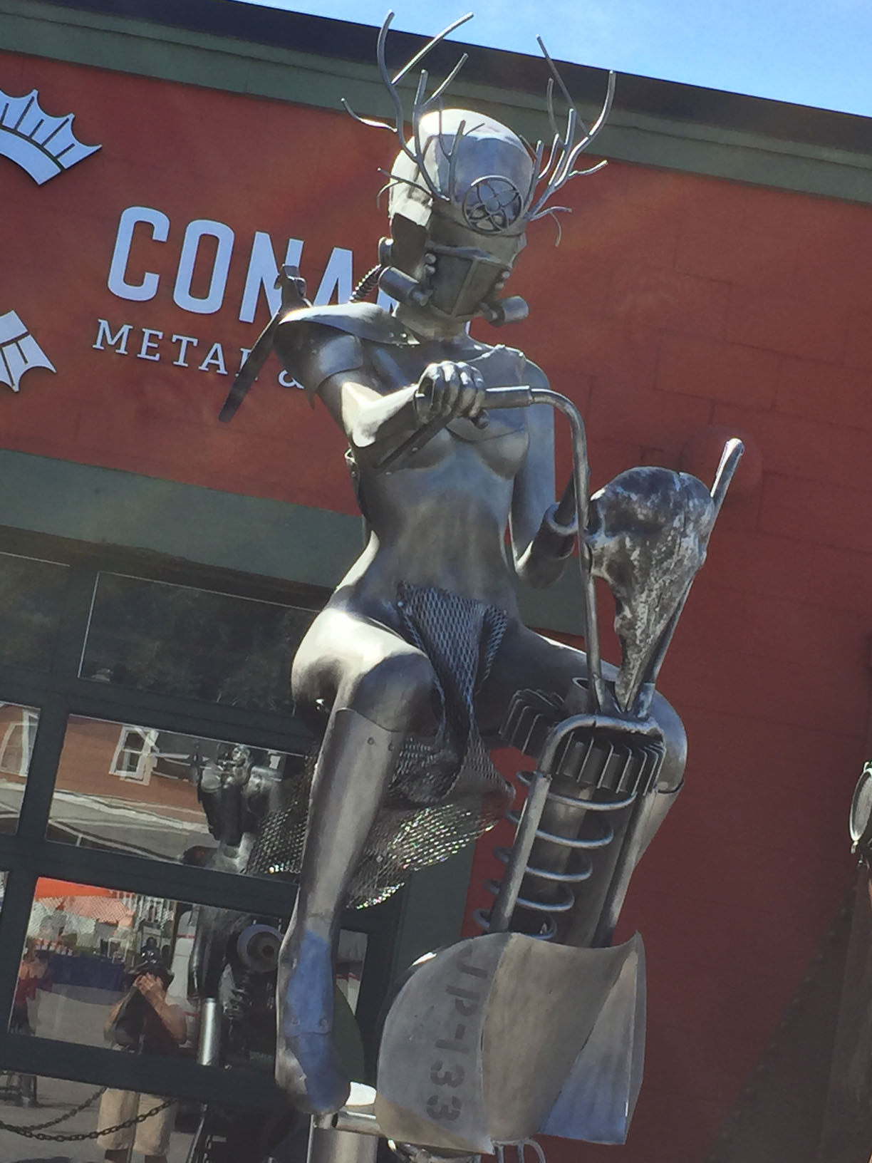
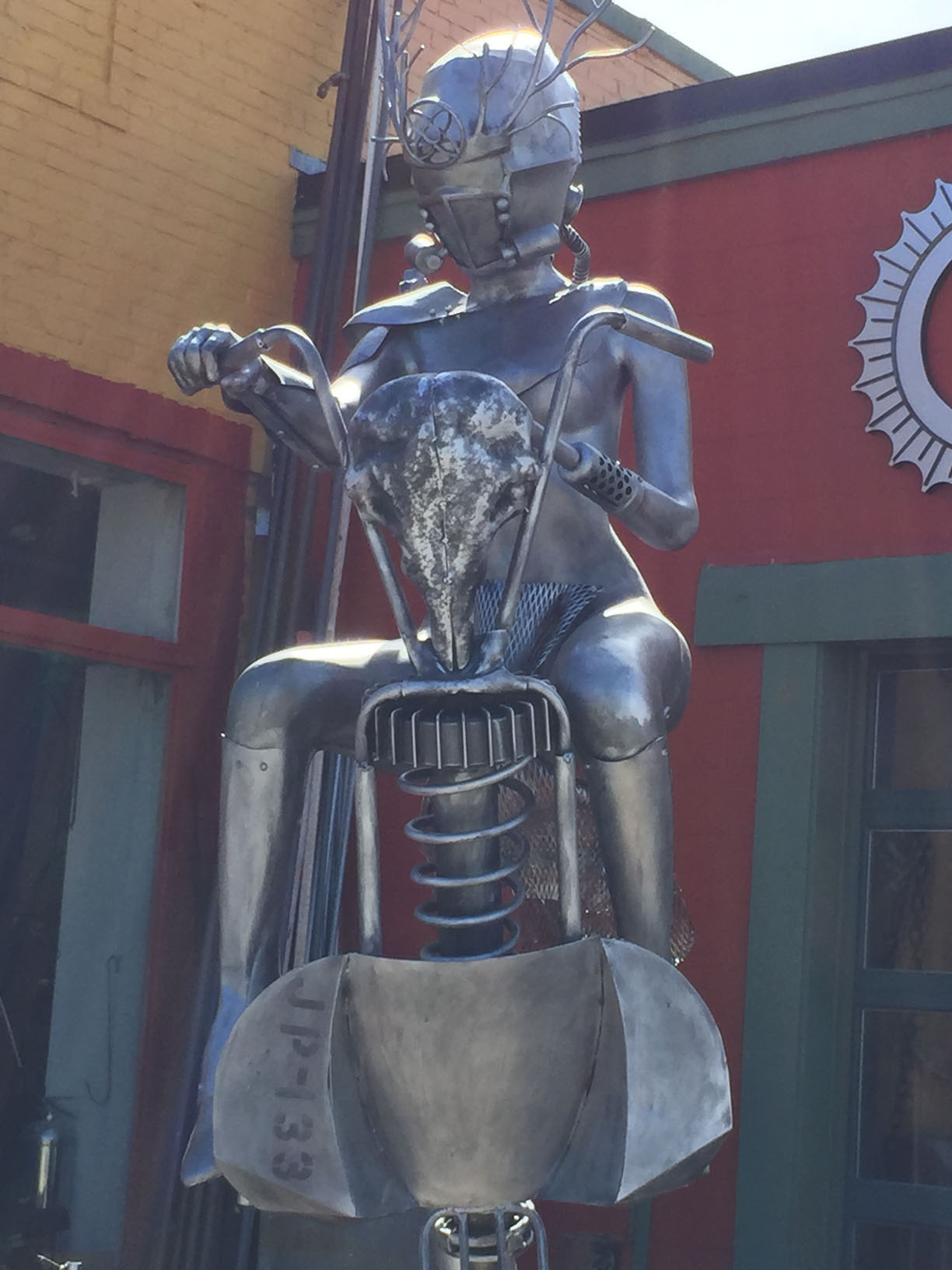
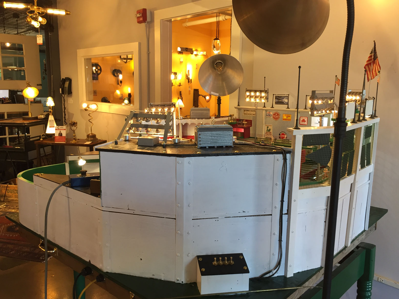
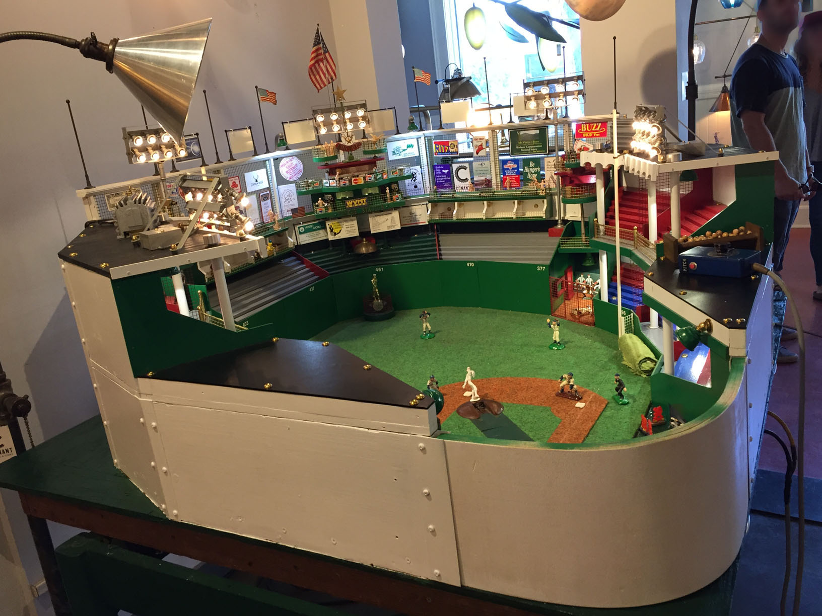
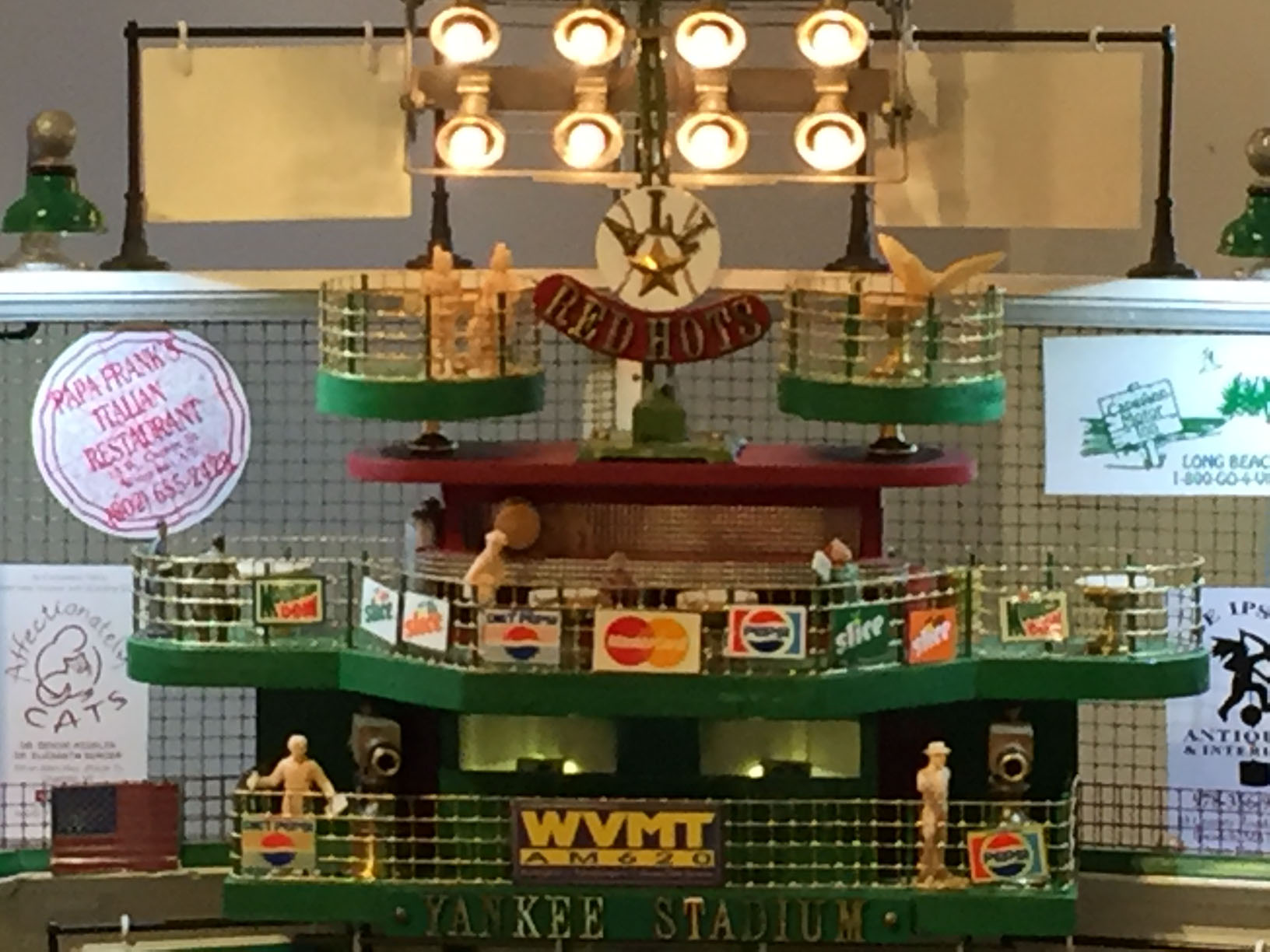
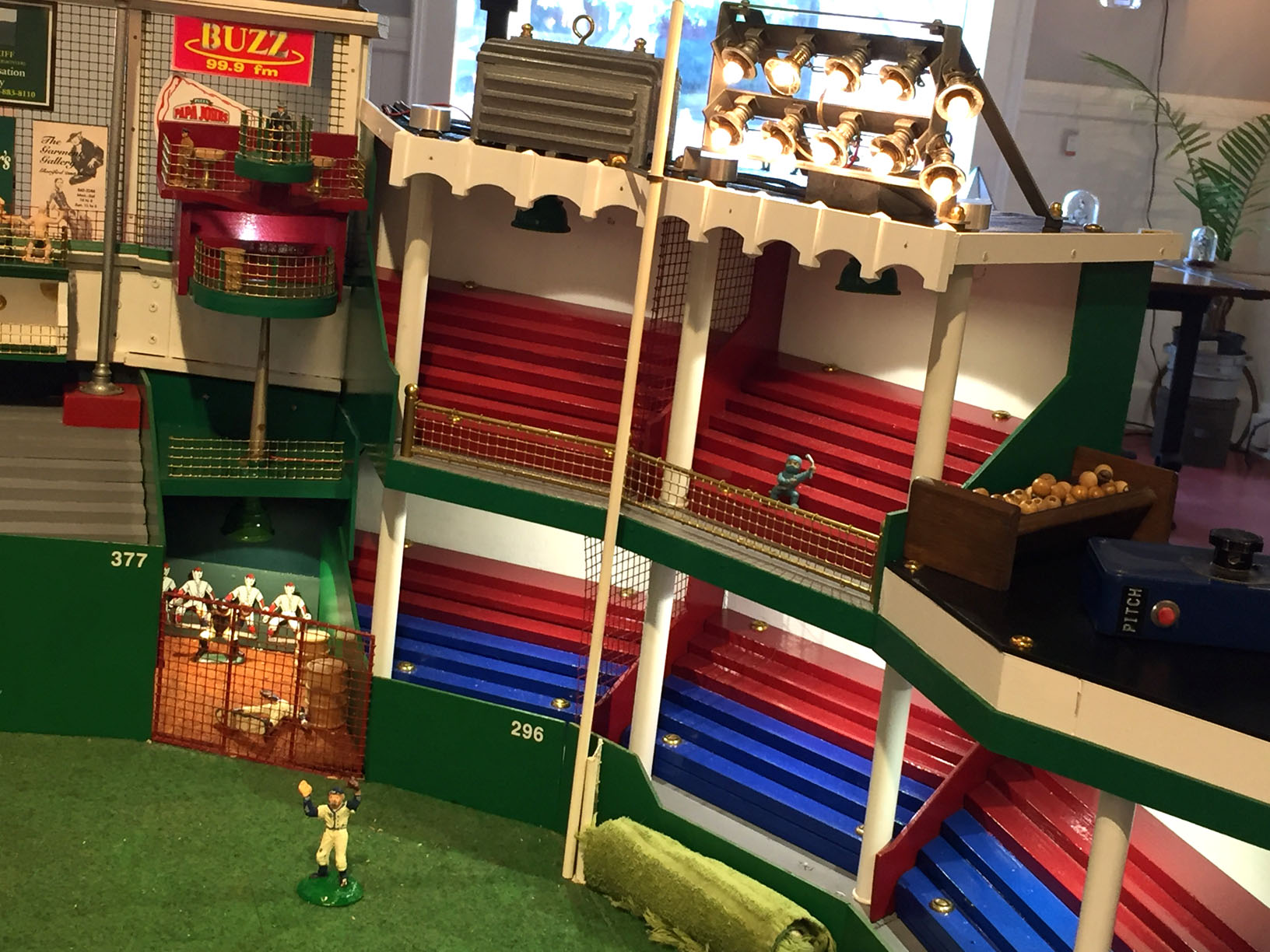
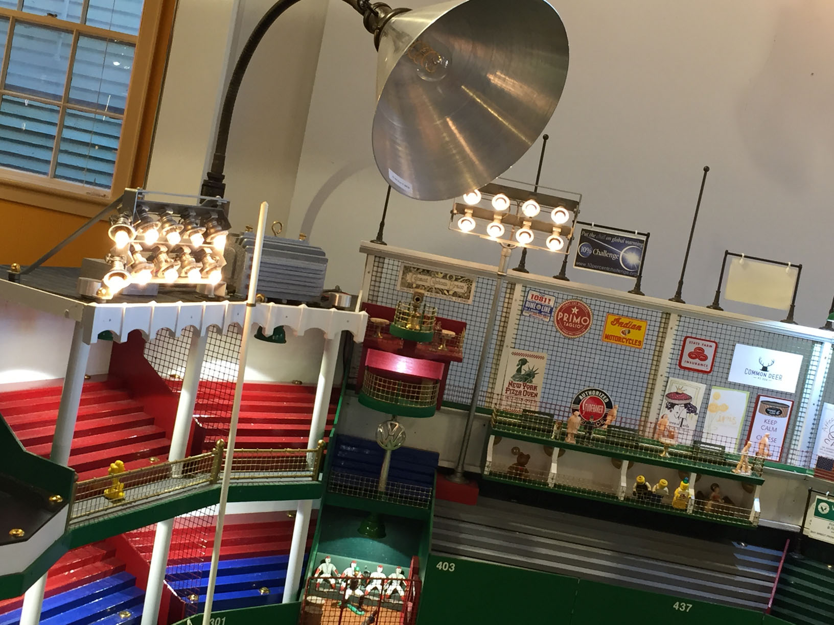
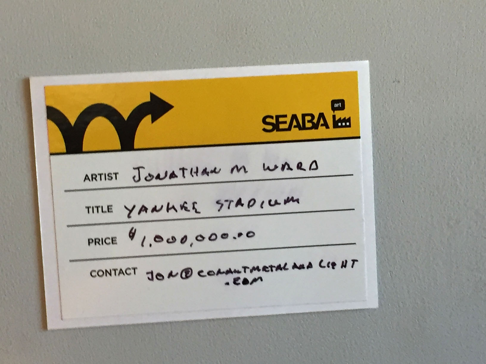
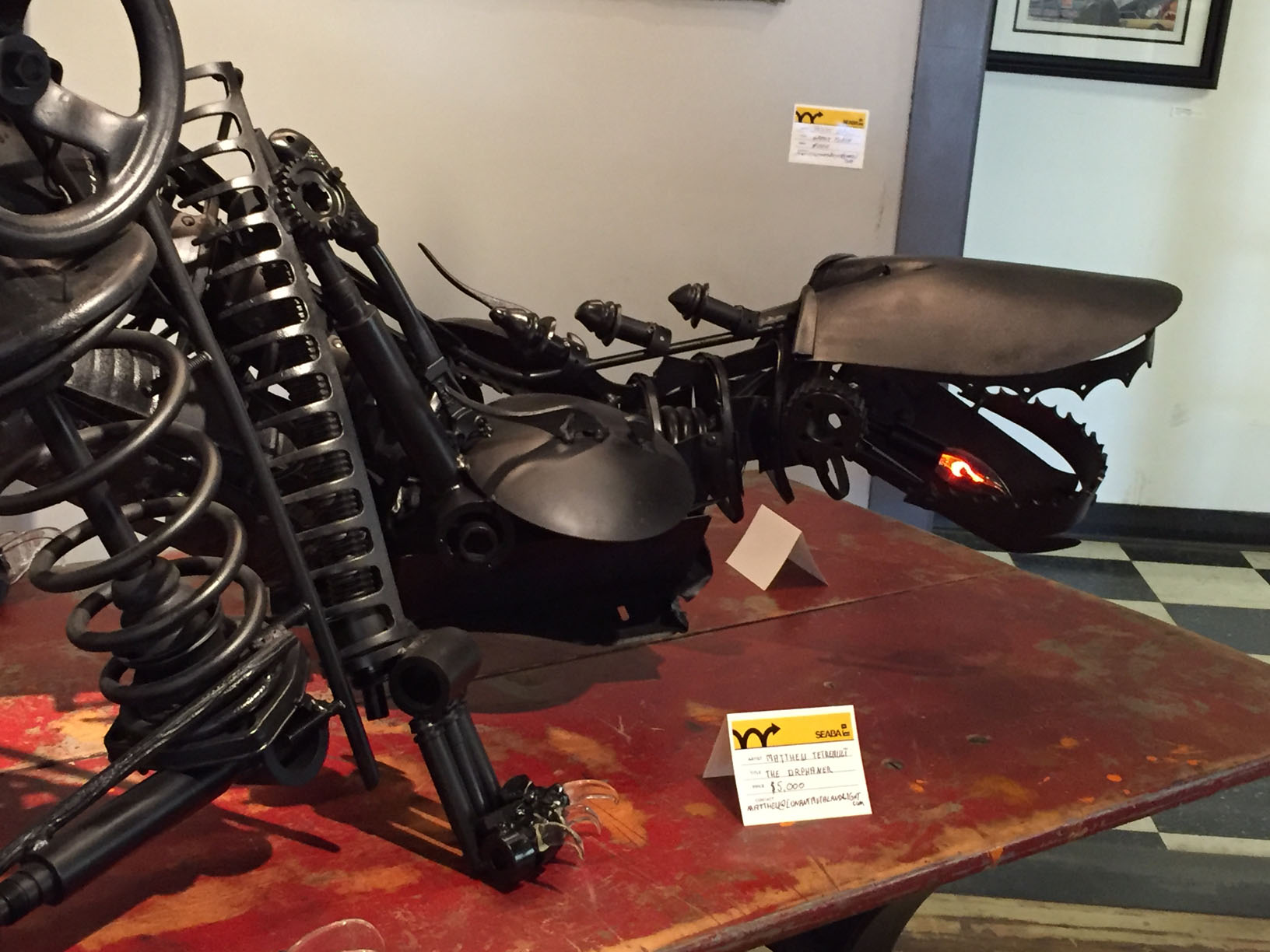
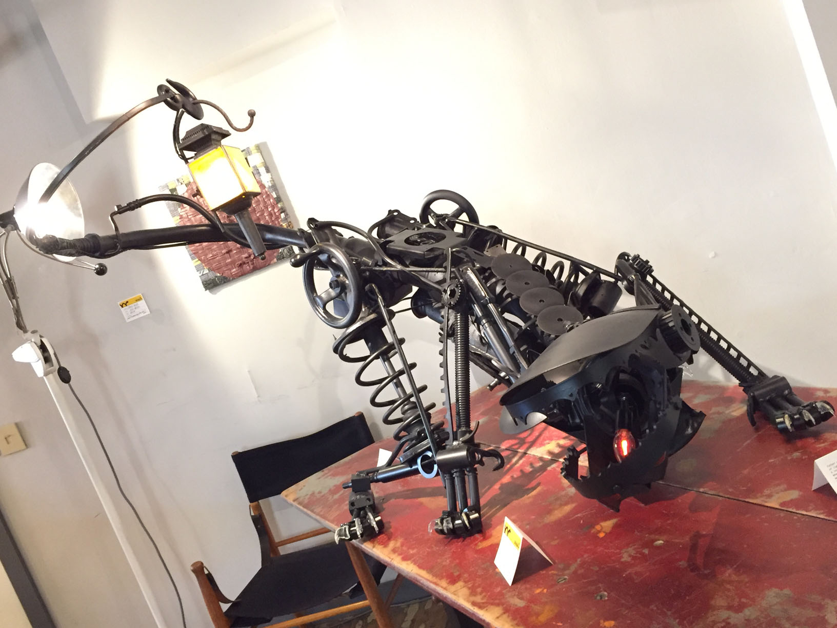
Just $750.00?! For that? I…I kind of want to get it.Moving on to the Conant Metal & Light showroom, I encountered playful, whimsical creations made from repurposed machinery and metal utensils.I never did figure out what all the switches and buttons did on this small model of Yankee Stadium, but they sure looked cool.
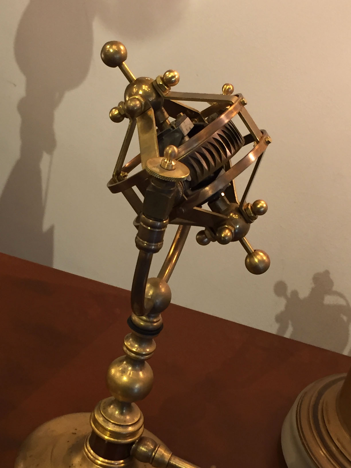
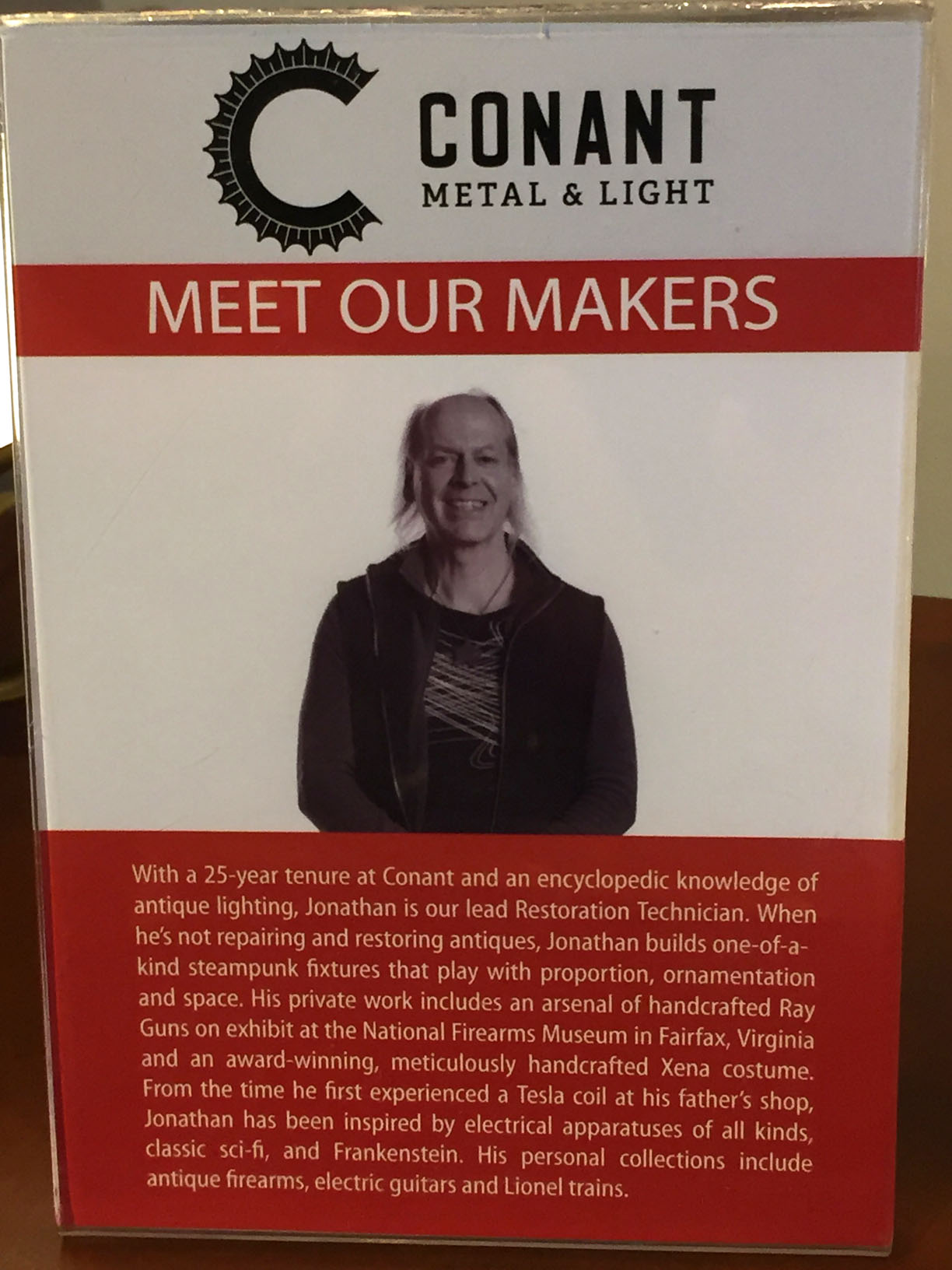
I don’t think he wants to sell it if he’s pricing it at a million dollars…This is a Scientific Gizmo, which is the more benign cousin of the Fiendish Device. You put it int he backdrop to suggest that you are a Cutting Edge Scientist With Aesthetics As Well As Really Weird Ideas.The maker of the Gizmo. Well, that explains everything.
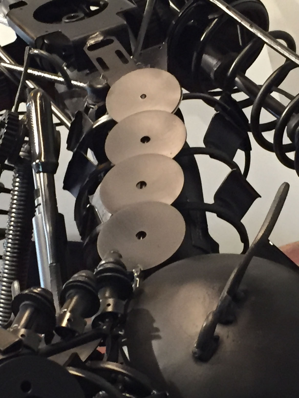
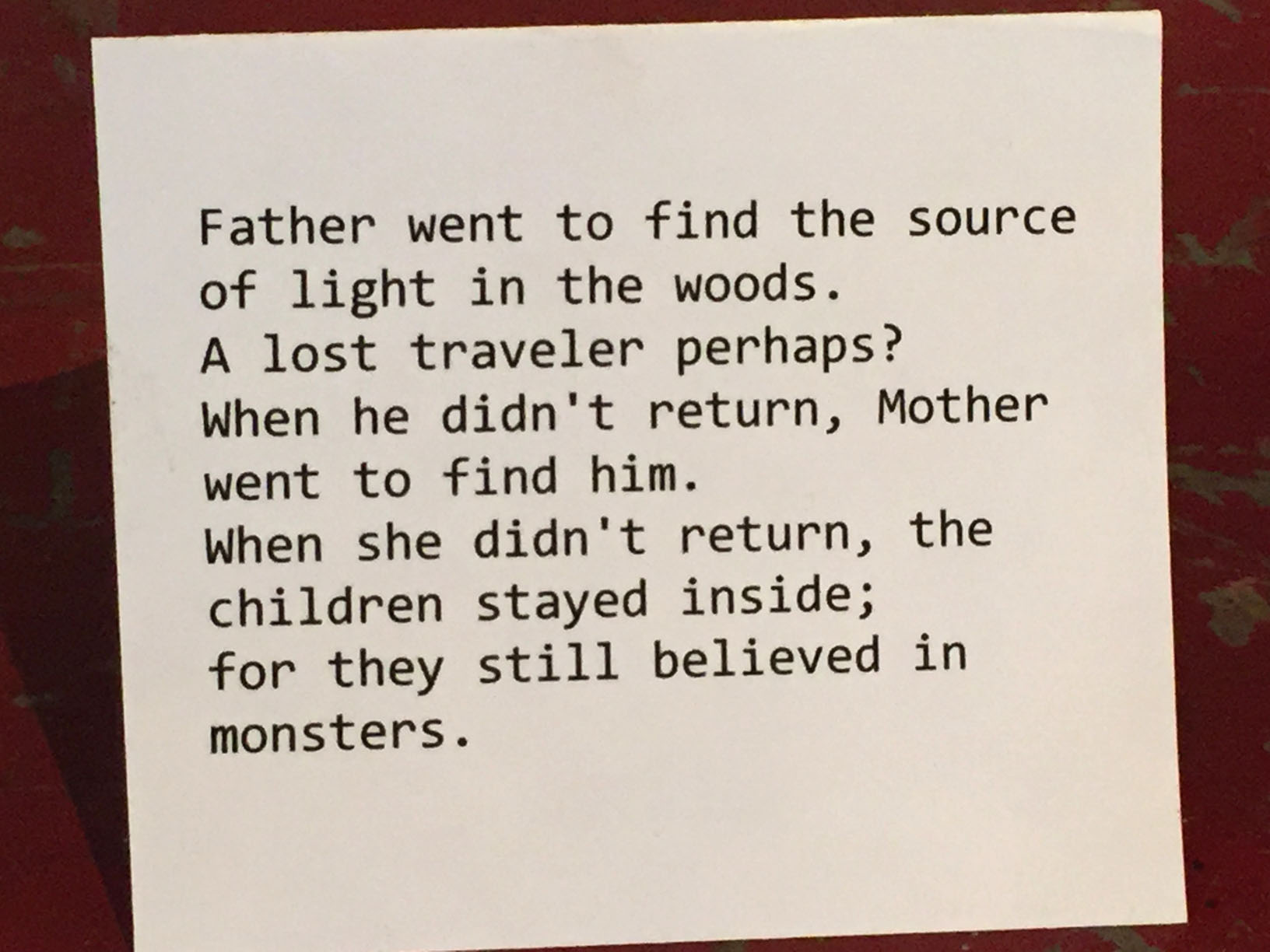
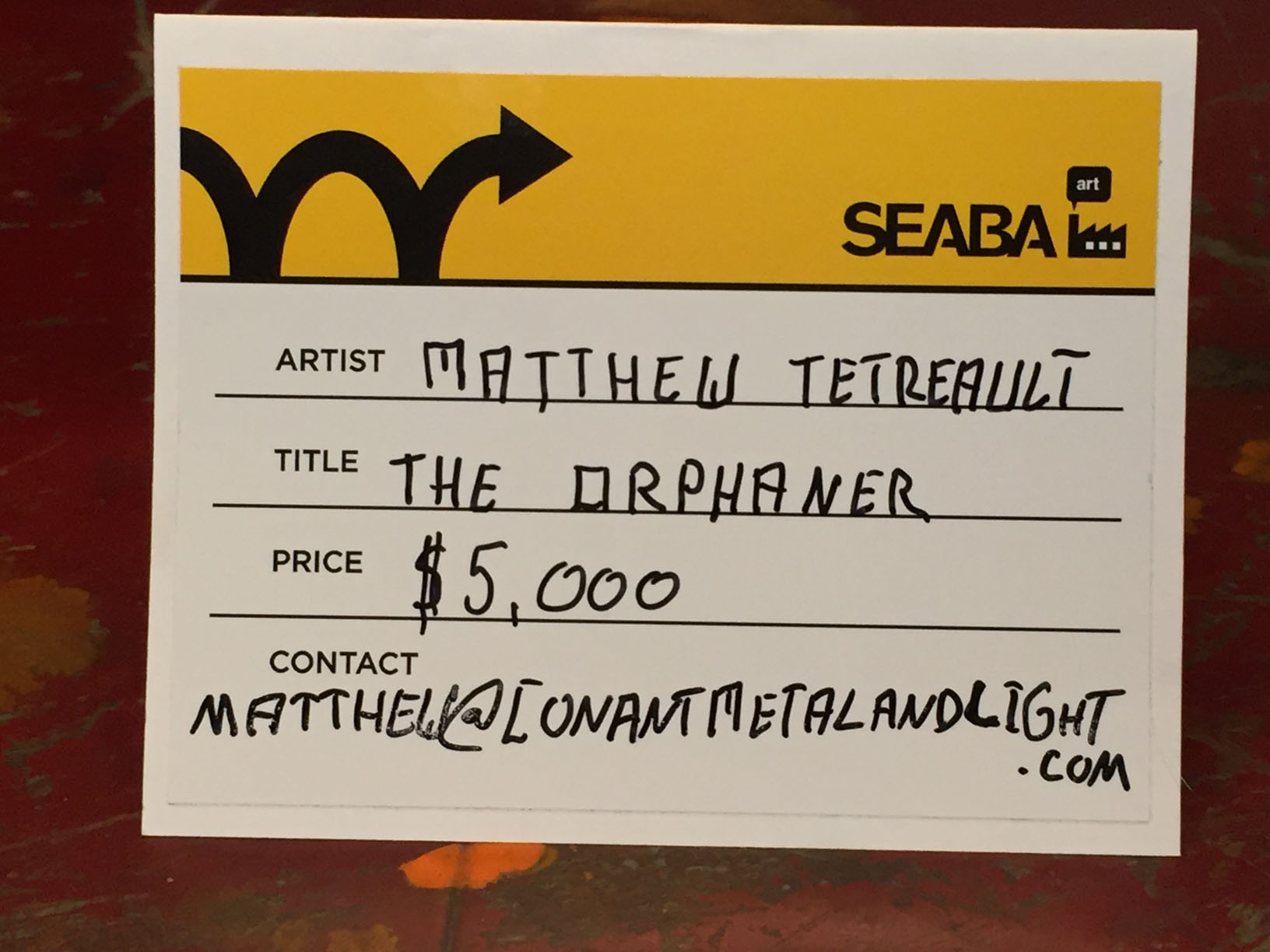
Spinal detail of the Orphaner.The cautionary tale accompanying this beast.
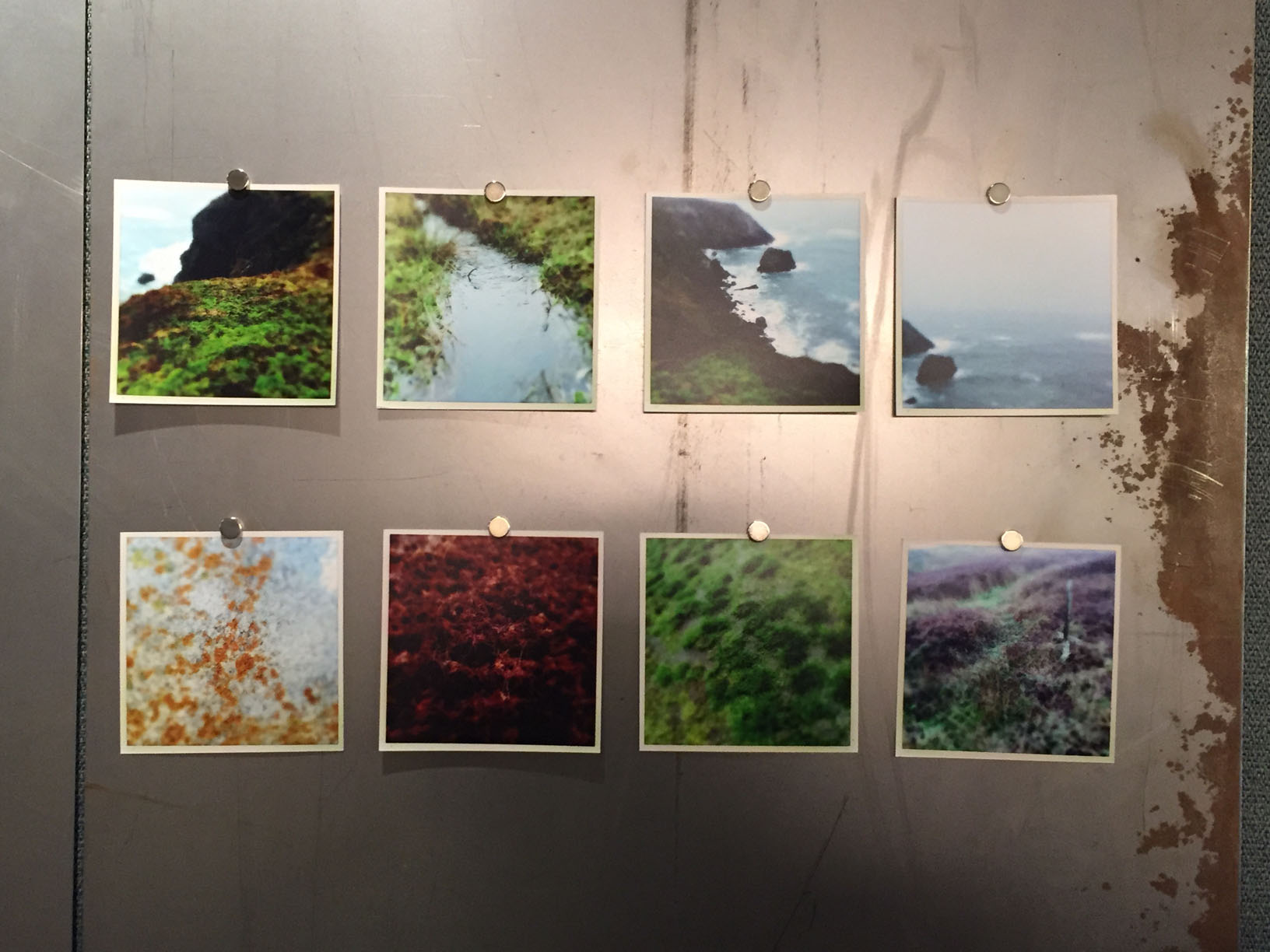
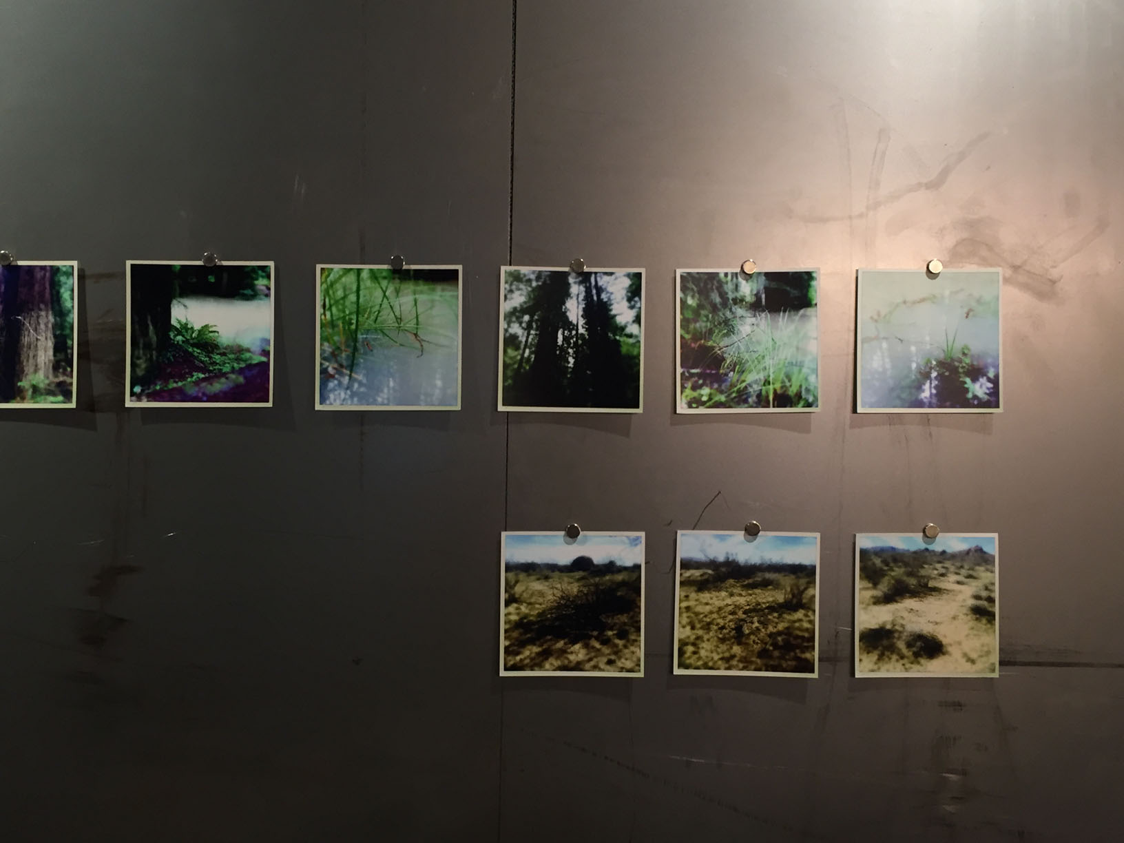
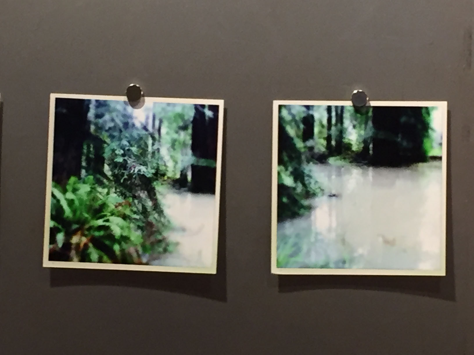
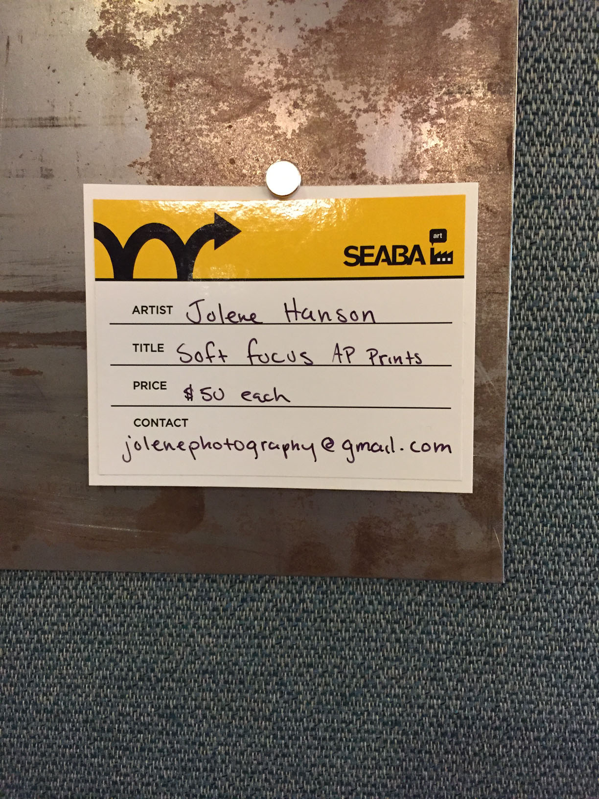
I thought the prints most effective displayed as they are here: on a raw piece of metal, held up by magnets in geometrical clusters. I suspect that the artist was probably looking for an easy way to show them off, but they really work as a series of pictures of softness, juxtaposed against the harsher material of the metal.
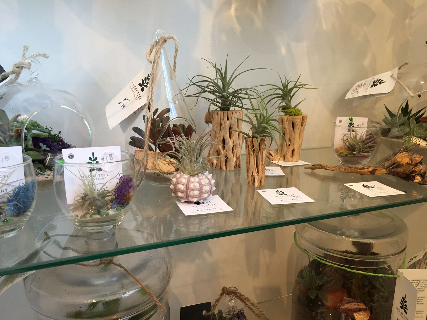
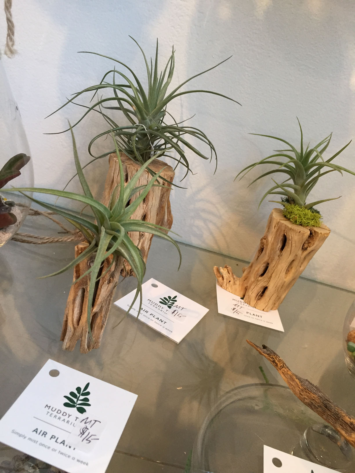
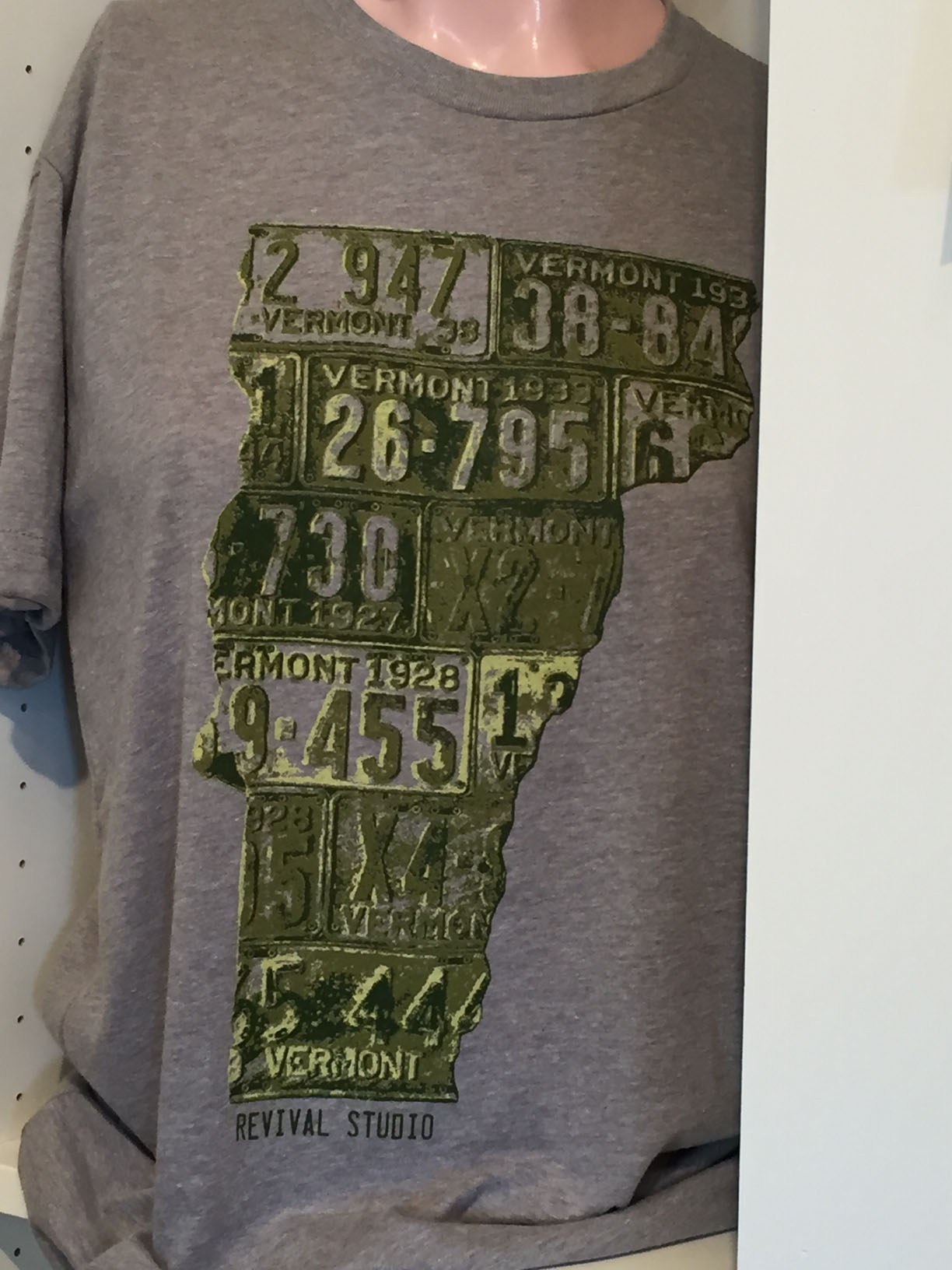
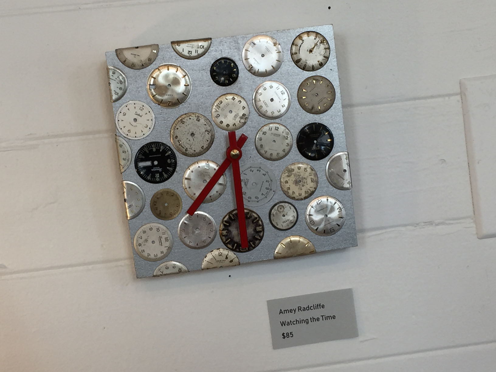
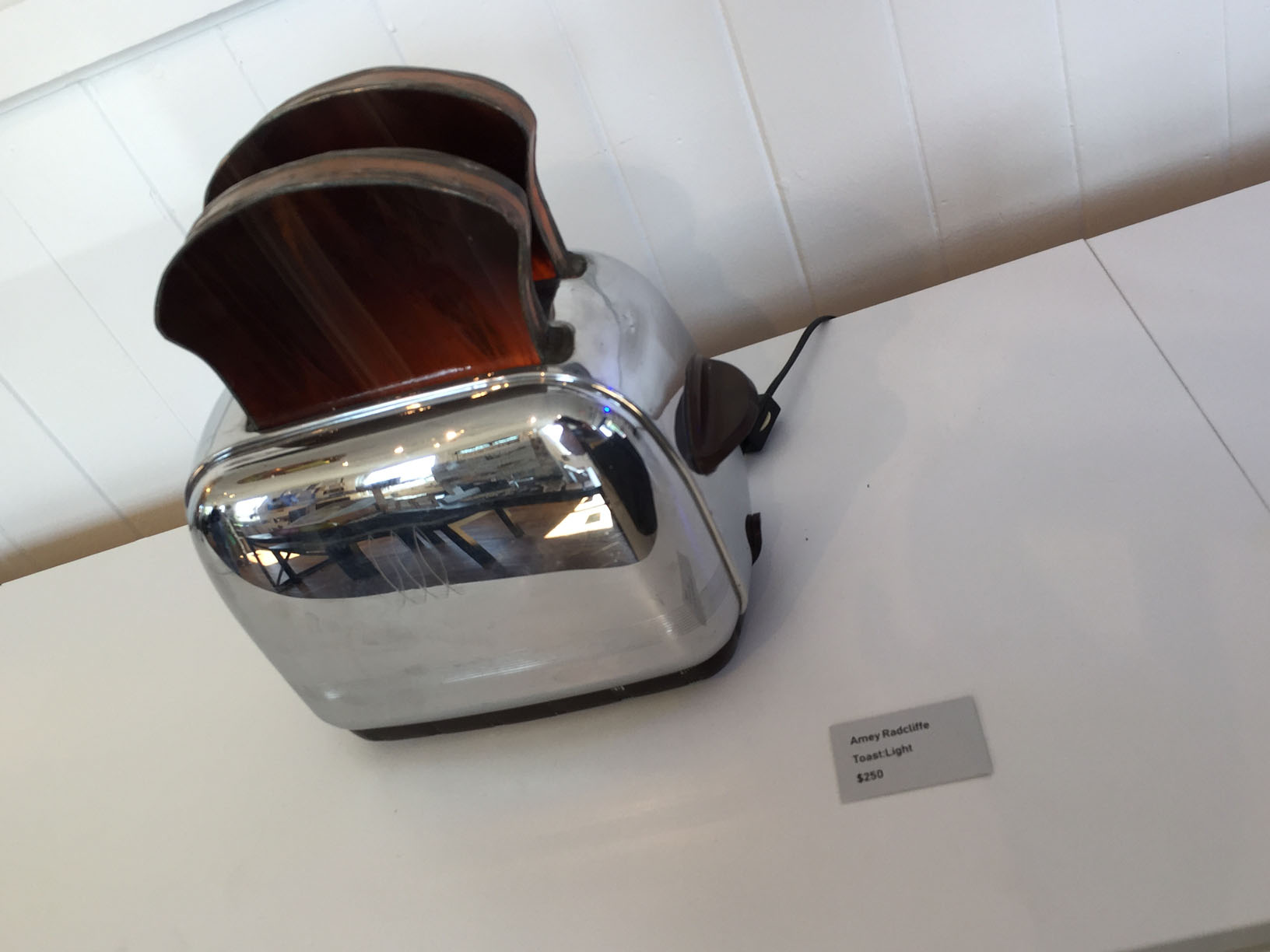
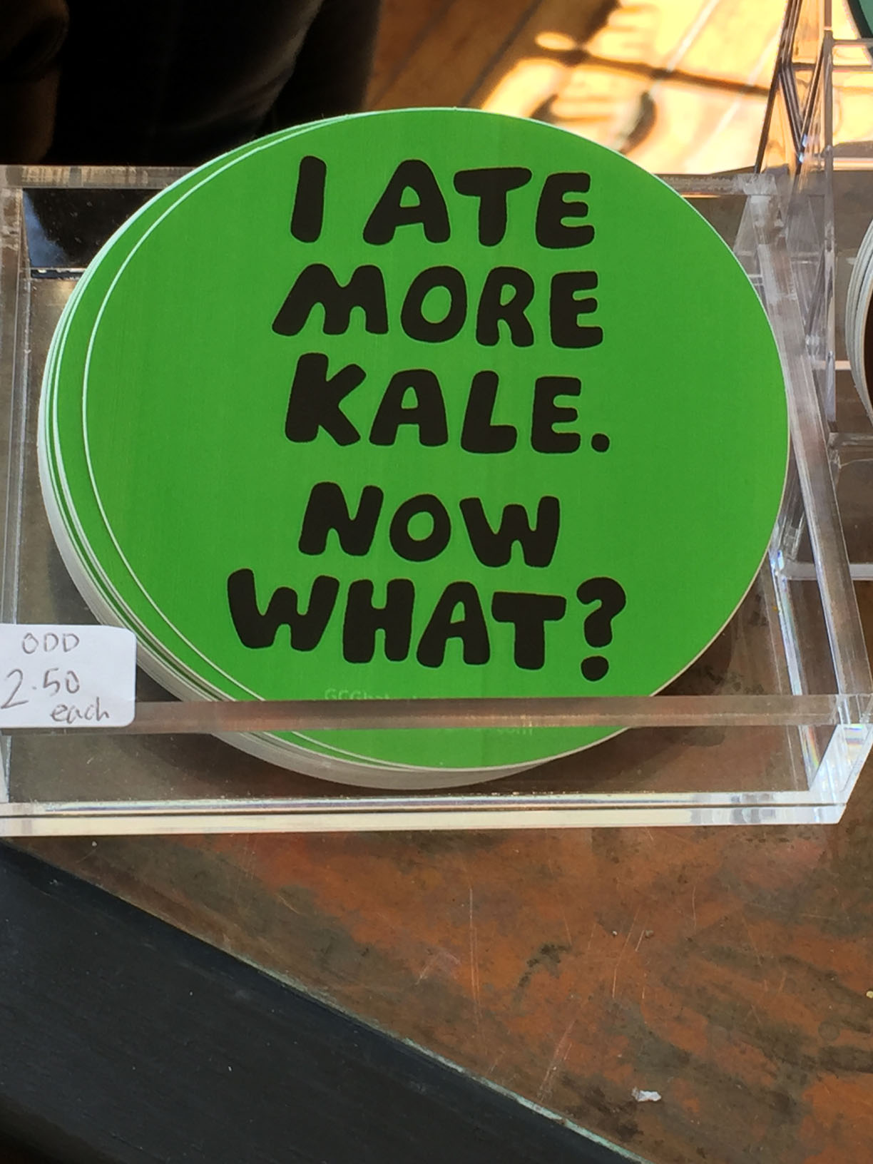
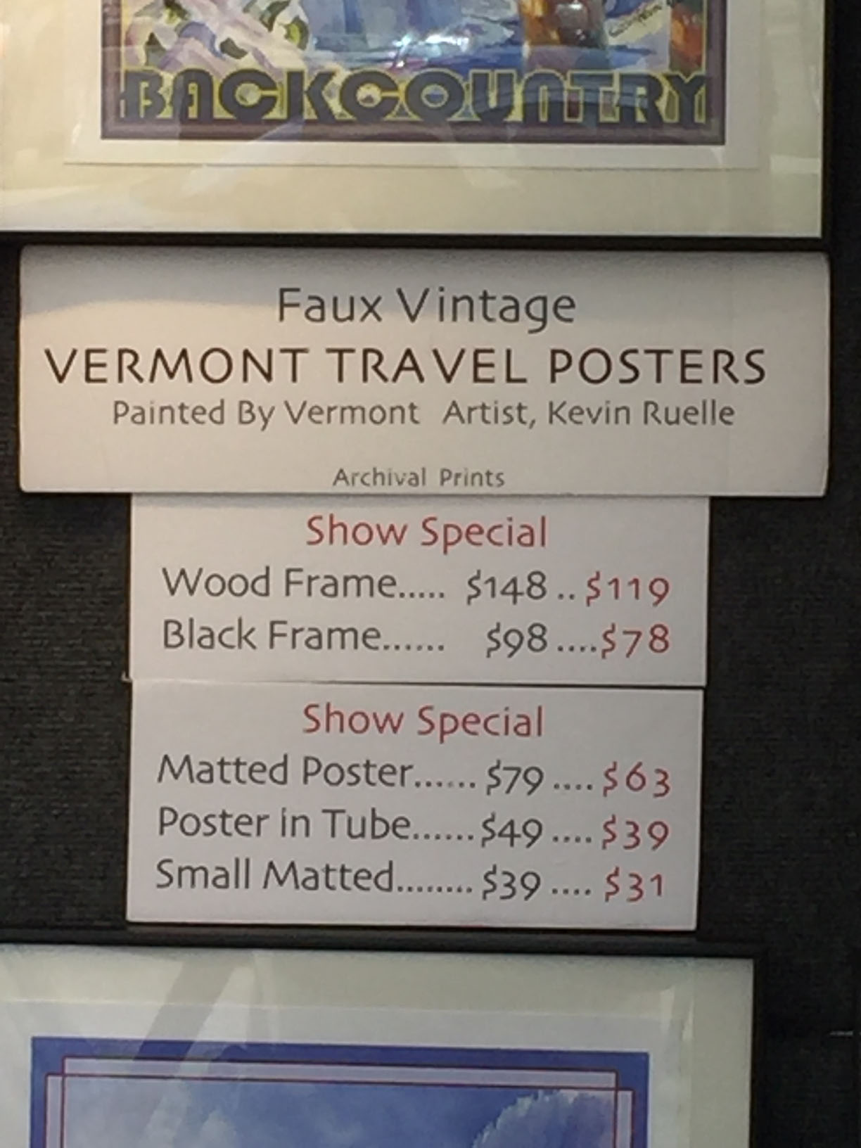
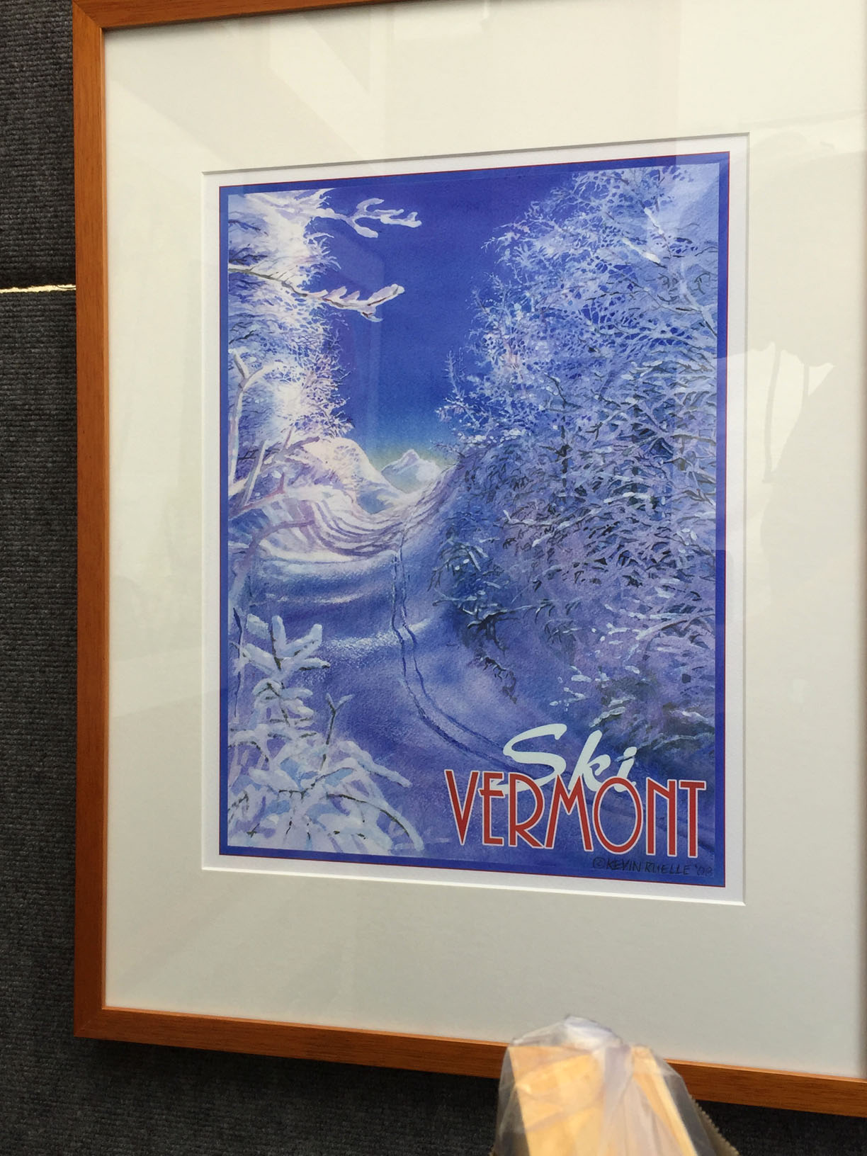
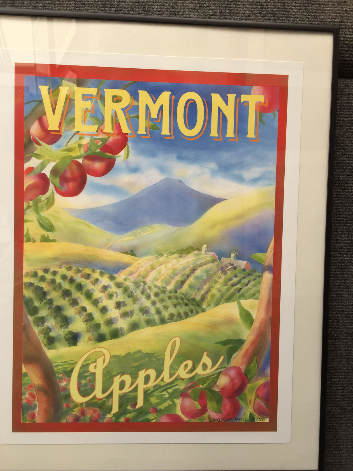
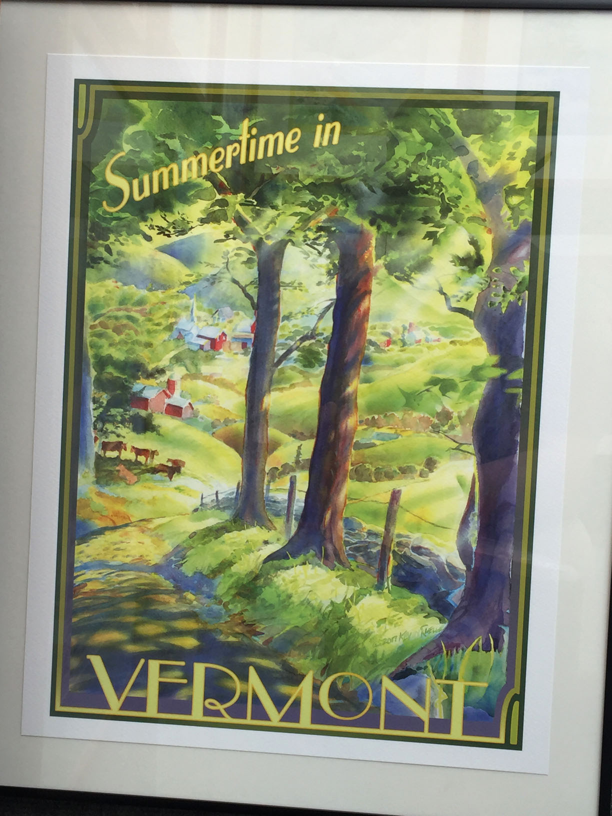
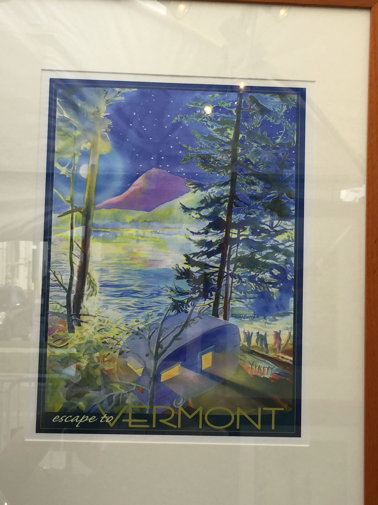
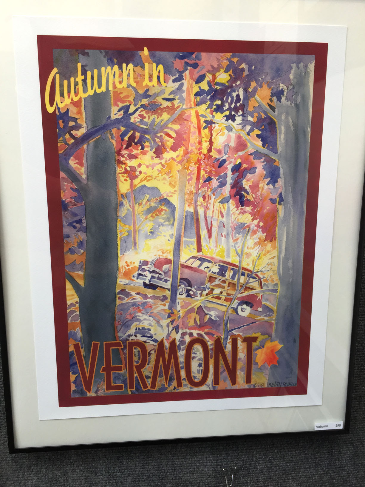
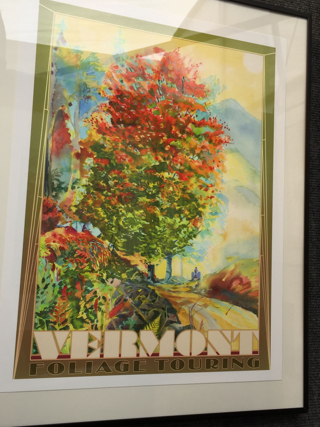
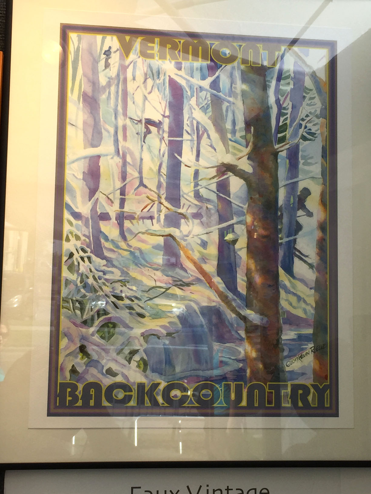
From Conant Metal & Light, I went into Thirty Odd, which is in the adjoining building.Muddy Toes terrariums contain real plants!Muddy Toes terrariums!Not sure what an air plant is, but they look great, especially on these weathered, perforated pieces of wood.T-shirt by Revival Studio, on display in Thirty Odd.Amy Radcliffe’s punny sculptures were very clever. They made me smile. I really hope that’s a functional clock. 😀The toast lights up, though this was not demonstrated.Toast:Light title card.The sequel to Bo Muller-Moore’s locally famous EAT MORE KALE stickers.Thirty Odd biz card.Last I stopped by a booth showing Kevin Ruelle’s vintage style travel posters. They glow with the pastel palette of an idealized Mid-Century, but they don’t seem to me naive or saccharine. Instead they come across as imaginative reinterpretations of the Perfect Vermont, an image that the state government and many Vermonters are highly committed to creating, perpetuating, and, of course, selling.This was one of my favorites, just because the cool blues and whites give that sense of a brilliant winter day with the sun bouncing off the snow, and everything’s so bright that even the shadows turn blue.See what I mean about playful reinterpretation? The Champlain Valley has never been that curvy, nor apple orchards that regularly geometrical. Yet the greenery, the requisite barn, and Camel’s Hump are all cooperating to exemplify pastoral temptation. You know that a marketer would probably squish all those elements together in one picture, as the artist does.Omitted from painting: E-mails from Burlington Electric telling you to minimize air conditioning use despite oppressive 97-degree-F heat index, 103% haze and humidity that causes your brain to melt out your ears, and an algae bloom that shuts down all the Burlington beaches so you can’t go in the lake to cool off.I purchased a framed print of this, mostly for the teardrop camper and the lovely blue palette. The more that I stare at the picture, though, the more that the yellow light form the camper reminds me of Thomas Kincaid, who painted empty houses, all soft and idealized, but always full of lurid orange light coming out the windows, like all the furniture was on fire inside. I hate Thomas Kincaid’s mushy religious sentimentalism. Also it’s hilarious to me that the clothesline is suspended over a muddy brook or puddle or whatever. Now hanging at work, the picture evokes both appreciation, annoyance, and critical attention whenever I look at it. I intended to get something more aesthetically inoffensive, for which I should have chosen that one with the cross-country ski tracks in it.Note how the station wagon coordinates with the foliage. That’s probably a flatlander behind the wheel. :p
At this point, I had seen just a small portion of Art Hop offerings. I wanted to get down to the Maltex Building, the stained glass studios, and other studios in the old broom factory [I forget its name]. However, I was running low on energy and money. I knew that, if I pressed on, I would exhaust myself and my bank account. Assuring myself that I could return on Sunday if I wished, I went home for lunch and a nap.


 After enjoying the Farmer’s Market, I progressed down Pine Street to some artist studios. First started at James Secor’s As Not Seen series. Labels of each piece are in separate photos below the photos of the pictures.
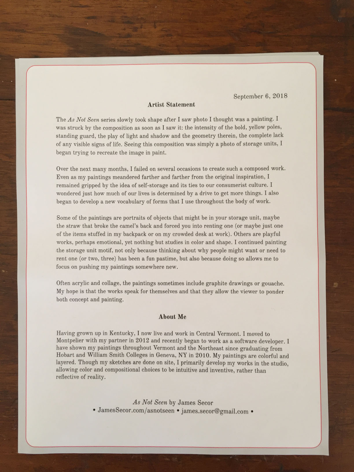


 Kara Torres had a small table out in front of the Soda Plant on Pine Street. She painted cartoony characters, not shown, as well as swirly, semi-floral watercolors, many of which she cut into bookmarks. I took pictures of my favorites and also bought two.